
Science fiction is replete with metaphor, so to continue our theme from the previous post, we’d like to explore some particularly unfortunate design trends using Gene Roddenberry’s idiom. Readers may recall Star Trek episodes where transporter technology was central to the storyline. If Scotty, or Miles O’Brien screwed up the transporter, horrible things might happen, like somebody getting beamed into a wall or something.

Something similar seems to be happening to buildings in American cities.

Where the quest for novelty and expression of a zeitgeist meets investor driven budget concerns and standardized off-the-shelf parts, we get the current architectural meme, “break up the box.” The idea comes from a dictum, frequently expressed in city design guidelines, that architects break up large masses into smaller scale modules. On the face of it, this sounds like a good idea. And it might be if it were done with any logic or rigor. The idea is that large buildings are inherently ugly and alienating. A categorical assumption like that should make you suspicious. We can all call to mind large buildings we’ve seen that are elegant, pleasing and allow us to get a sense of human scale by the way they are composed. Some large buildings are dreary and oppressive, and these codes can probably be seen as a reaction against failed utopian megastructures like the public housing projects of the mid 20th century.

At the same time, in a post-postmodern world, we don’t really have a coherent style we can identify with our time. Other eras had dominant styles, and most people were pretty familiar with them. It was pretty easy for the lay person to tell which designs embodied the style well and which were interpreting it poorly, or in a superficial way. Today it’s very hard to judge competent application of a style, since we can’t even agree on what styles are appropriate. The culture of the architecture and design world has become divorced from the culture of building and trades, exacerbating the problem. Before this schism, builders with little formal education participated in a culture of building that yielded uniformly coherent, pleasing forms regardless of the budget of the project.
Today’s typical speculative buildings, by contrast, offer no sense of craftsmanship, and often flat-out reject well established principles of symmetry, proportion, hierarchy or really any kind of visual logic at all. Instead, we’re presented with pointlessly arbitrary shapes and materials, arranged in a skin-deep composition that starts to look more and more forced, the more we’re forced to look at it.
Author Charles Siegel puts it pretty clearly:
“Unfortunately, almost all contemporary architecture schools ignore traditional design, so architects who try to imitate the human scale of traditional architecture sometimes do not know its basic principles and come up with very strange designs. Their most common error is trying too hard to break up the box: they overdo it and produce cluttered designs, because they do not know that traditional architecture uses a nested hierarchy of scales, with a ratio of about three-to-one between each element and its sub-elements.”
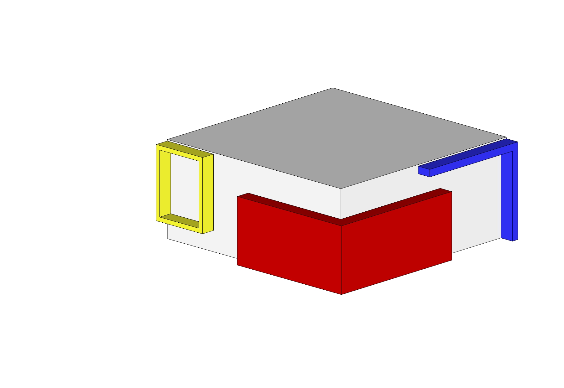
Here’s how it works. A goofy array of shapes, suggesting a bunch of different smaller volumes are overlapping in space.

This is what we’re supposed to understand about those shapes; that we’re actually looking at several distinct volumes that have materialized in the same space, with little bits spilling out around the edges.

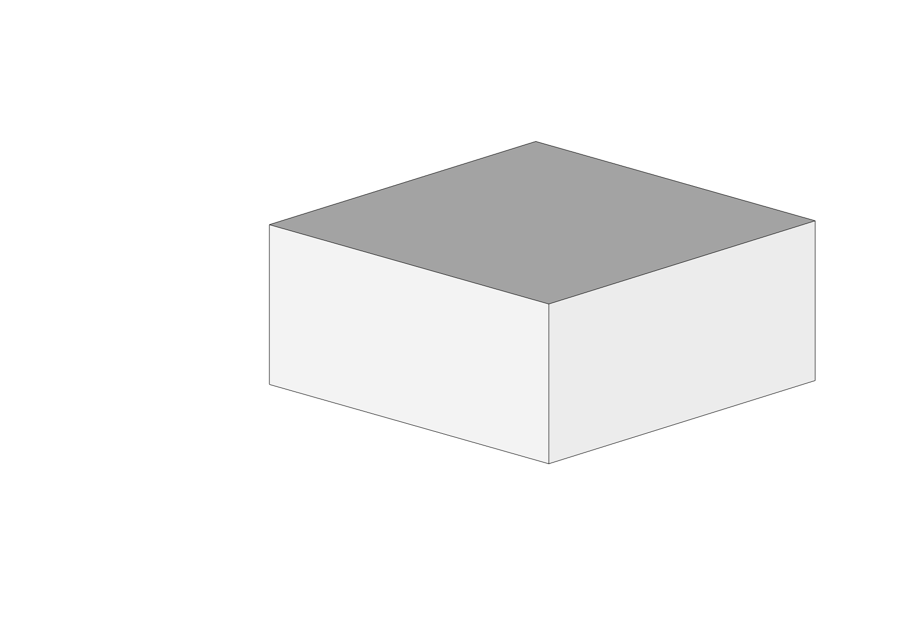
Viewed from above, we clearly see this for what it is. A silly outfit on the surface of a box.

Take off the garments, and the true nature of the form is apparent.
Let’s watch the design process for this obnoxious gimmick in action:

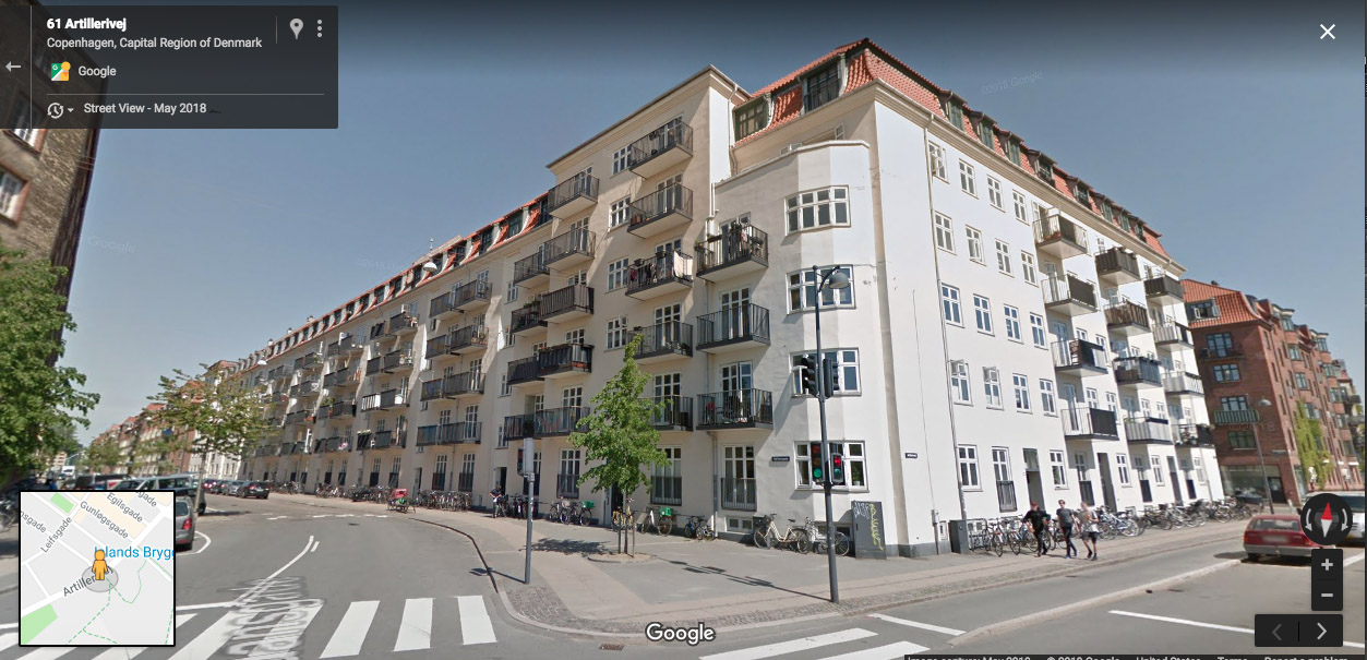
What’s the answer to this mess? We have two recommendations. First, build smaller. Human scaled buildings, like the ones we built throughout human history, don’t need to be broken up. Take a walk along NW 21st for example and this will be very evident. Second, if you must build big, just own it and be big. Appropriately scaled details, per Siegel’s ratios can make a beautiful, coherent composition that doesn’t rely on cheap gimmicks. Our counterparts across the Atlantic have been doing this quite well for a very long time. We’ll conclude with a selection of European examples, in a variety of styles. We’ve rounded up four Danish examples, followed by three from Rome. All of them are large, but none look like a smattering of smaller elements arbitrarily jammed together. You be the judge…


