Polemics

I was in the right place, but it musta' been the wrong time...

Juxtaposed.jpg

Here’s a case of two recent residential infill projects that neatly demonstrates several flaws in the way we think about plan for new middle scale buildings.

5 row angle.jpg

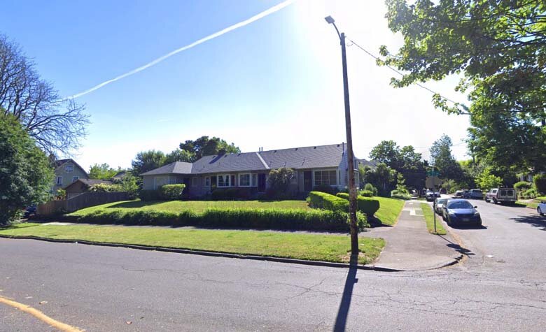
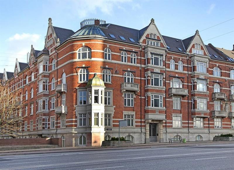
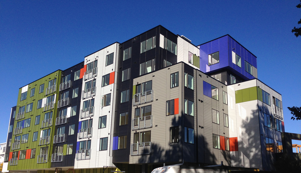
Case 1 is located about 100’ east of MLK Jr. Blvd. On paper, this building is doing what middle scale zoning should – providing a step-down transition between the midrise apartment zone (which happens to contain a brand new 5 story apartment building in this case) and the single family homes to the east. To be honest, it’s not even failing at that task per se. We like this building for a number of reasons. Its vernacular profile and consistent and calm architecture is timeless and skillfully executed. It presents a symmetrical, legible front to the street, and does not go through odd contortions to accommodate garages. It comprises five identical row houses in a line perpendicular to the street. The only complaint here is that this bread loaf loads its slices from doors facing the long side, which is an interior lot line. We’ll have more to say on this in a bit…

5 row .jpg

Our other case, located about 500 feet east, is on a corner site, with the outer side lot line facing Irving park. There’s not much positive to say about the architecture here.


duplex.jpg

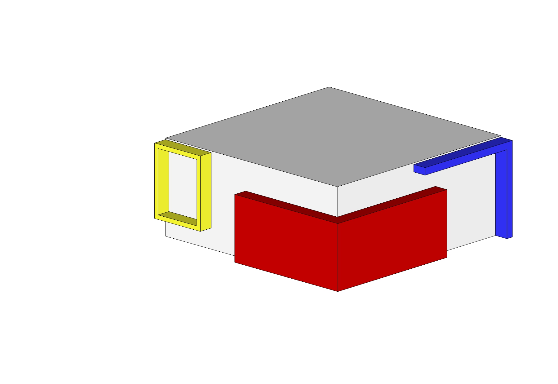
This mess of arbitrary shapes and pointless rectangles is configured as a side-by-side. The building itself is extremely awkward. It’s three stories tower over its bungalow neighbors, due to the fact that its ground level is dominated by garages. This is one of those buildings were parking dominates and living space is shoehorned in around it. The two units suffer from the “floor is lava” problem, where the main living space is far enough from the yard that they have minimal connection to it. Unsurprisingly, the yard is just a patch of beauty bark surrounded by a 6’ “privacy fence,” Interspersed with posts that support stairs and decks for the levitating house above.

Beauty Bark.jpg

The gist of this post is that zoning orthodoxy instructs planners to put the “most intensive uses” along arterial streets, where there is high traffic (car and foot) and frequent transit. So far so good. The logic fails when we look at what this really produces. Broad brush zoning application doesn’t take things like Irving Park into account. Nor does it do much to relate bulk and height to the supposed intensity of a use, which, in residential areas, is simply measured in terms of number of units.

Wouldn’t it make more sense to have the taller of these two buildings between homes and mid-rise apartment blocks? Wouldn’t it make more sense for the side entry building to be on a lot where those entries can face the street, or better yet, a street with a big park on the other side? There’s precedent for the latter only a couple blocks away! Here’s a bungalow-bar type fourplex facing Irving park, with its entries facing the long side of its corner lot. How hard is this to figure out? The precedent is right fucking there, 200 feet away!

Precedent.jpg

The big idea behind form-based codes is that the form factor of the building is more important than the internal configuration, since that determines compatibility.

5 row doors.jpg

This nice row of front doors seems kind of wasted here. Wouldn’t it be better to have these lined up facing Irving Park across NE 7th? Compare:

duplex vs 5plex 1.jpg
duplex vs 5plex 2.jpg

Perimeter Blocks

In this post we’re going to take a look at one of the residential typologies we experienced in Denmark, the Perimeter Block. They are fairly common in many northern European capitals, and we’ve seen something similar in places like Sweden and Germany. They are the foundational residential architecture of Copenhagen and typify the city more than any other city.

Exterior+photo.jpg

One of the first things one notices in Copenhagen is the rather large, uniform blocks in many central neighborhoods. Above is park in Vesterbro, which is mostly late 19th and early 20th century construction. Here is the same area, viewed from above:

Aerial.jpg
Aerial Axon.jpg

As you can see, what looks like a massive, solid block from the street is actually quite a slender structure with a large void in the center. From front to back, these buildings are typically about 36 feet thick or less. This creates a large central courtyard which enjoys ample air and light.

Big Axon.jpg

The reason the buildings lining the courtyard are so thin is that they are only one unit deep. That means that each unit has two window-walls, one facing the street and the other facing inward to the courtyard.

Rendered Section.jpg
Rendered Elevation.jpg

This configuration is possible because instead of a single entry and a central corridor, these units are in stacks that share a central staircase. Each “front door” typically serves no more than 10 families.

Rendered Section and Plan.jpg

Often a second back stair provides access from kitchens to the courtyard side of the building. The generous size and shape of units makes them ideal for families. Most importantly, the through-building format of the stacked units allows them to function like a house in terms of daylight and cross-ventilation.

Air and Light.jpg

While the outsides of the blocks can seem at times hard and dreary, the interiors are a green oasis.

The central courtyard creates places for children to play outside their apartments in safety. They also allow for gardening, bike sheds and general relaxation for the residents of the block, who essentially share their own private park.

courtyard-wide-600.jpg

The biggest downside of the perimeter block is that in some cases, they can be monotonous and grim from the outside.

gloomy boliger.jpg
variety.jpg

In older neighborhoods, the perimeter building was not a single building, but a series of segments joined together to create a perimeter block. The inherent variety livens things up. Different colors, materials, and often, even different floor heights provide variety. Buildings of different ages and conditions foster diversity.

block variety.jpg
fancy block.jpg

Better designed blocks eliminate this by creating detail appropriate to the scale of the building. Note the “rule of thirds” hierarchy, where every element is approximately one third the scale of the larger element it is nested within.

The perimeter block is alive and well today. We found some very exciting examples in the new urban Sluseholmen neighborhood in the Sydenhavn district. Built on former industrial docklands, the area’s perimeter blocks are bounded not only by streets, but a network of canals.

sluseholmen_ark031108_ebbeforup_1.jpg
sluseholmen2.jpg
sluseholmen.jpg

By contrast, the typical American apartment building format provides a primary entry and access to units via a central corridor, like a hotel. There is an advantage of efficiency, since a few stairs and elevators can serve an entire building. However, the building itself becomes much thicker from front to back and most units end up having only one outside-facing wall

American Prewar Building.jpg

In a typical pre-war apartment building, unit width was greater than depth in order to maximize daylight. In environmental design, the area of a room that is considered “daylit” is defined as the height of the top sill of the window x 2. So if the top of the window is 7 feet off the floor, then 14 feet inboard of the window is daylit.

American Prewar Unit.jpg

If this situation had some drawbacks, the status quo in the industry today is exponentially worse. In recent years (perhaps 2 decades or so), large developers realized that they could maximize leasable space by turning the units sideways so that the short end faced the outside. This resulted in the default configuration of contemporary urban apartments; long narrow units with daylight at the “end of the tunnel.” This configuration maximizes efficiency and generates the most bang-for-the-buck for investors.

American Contemporary Building.jpg

This is accomplished by making a bedroom that is not quite a legally-defined room, and therefore needs no window, and eliminating the kitchen as a separate room, moving it onto a wall in the living room. As a result, we end up with a long dark unit. This type of building is really only suitable for small households. To the best of our knowledge, this double-loaded hallway building configuration is not allowed for apartment buildings in Denmark.

American Contemporary Unit.jpg

The double-loaded central hallway configuration can pack up to140 units per acre, compared to the typical Danish courtyard building which averages 60-70 units per net acre. That’s a lot lower, but for comparison, a typical single family block in Portland has a density of about 9 units per net acre.

modera_morrison_dar2_img_01-1024x612.jpg

Very large American apartment buildings like this one proposed for SE Belmont fill whole blocks, but unlike their Danish counterparts, they maximize the economic output of the building system while providing a unit type that is not very adaptable. We’d argue that while the American system is good for investors, and helps cities achieve short-term goals of reducing the shortage of dwelling units generally, the type and usability of these units is probably less valuable for the long-term stability and sustainability of an urban neighborhood.

Transporter Accidents

beammeup.jpg

Science fiction is replete with metaphor, so to continue our theme from the previous post, we’d like to explore some particularly unfortunate design trends using Gene Roddenberry’s idiom. Readers may recall Star Trek episodes where transporter technology was central to the storyline. If Scotty, or Miles O’Brien screwed up the transporter, horrible things might happen, like somebody getting beamed into a wall or something.

Accident.jpg

Something similar seems to be happening to buildings in American cities.

603+Concord+Ave.jpg

Where the quest for novelty and expression of a zeitgeist meets investor driven budget concerns and standardized off-the-shelf parts, we get the current architectural meme, “break up the box.” The idea comes from a dictum, frequently expressed in city design guidelines, that architects break up large masses into smaller scale modules. On the face of it, this sounds like a good idea. And it might be if it were done with any logic or rigor. The idea is that large buildings are inherently ugly and alienating. A categorical assumption like that should make you suspicious. We can all call to mind large buildings we’ve seen that are elegant, pleasing and allow us to get a sense of human scale by the way they are composed. Some large buildings are dreary and oppressive, and these codes can probably be seen as a reaction against failed utopian megastructures like the public housing projects of the mid 20th century.

developer-modernism.jpg

At the same time, in a post-postmodern world, we don’t really have a coherent style we can identify with our time. Other eras had dominant styles, and most people were pretty familiar with them. It was pretty easy for the lay person to tell which designs embodied the style well and which were interpreting it poorly, or in a superficial way. Today it’s very hard to judge competent application of a style, since we can’t even agree on what styles are appropriate. The culture of the architecture and design world has become divorced from the culture of building and trades, exacerbating the problem. Before this schism, builders with little formal education participated in a culture of building that yielded uniformly coherent, pleasing forms regardless of the budget of the project.

Today’s typical speculative buildings, by contrast, offer no sense of craftsmanship, and often flat-out reject well established principles of symmetry, proportion, hierarchy or really any kind of visual logic at all. Instead, we’re presented with pointlessly arbitrary shapes and materials, arranged in a skin-deep composition that starts to look more and more forced, the more we’re forced to look at it.

Author Charles Siegel puts it pretty clearly:

“Unfortunately, almost all contemporary architecture schools ignore traditional design, so architects who try to imitate the human scale of traditional architecture sometimes do not know its basic principles and come up with very strange designs. Their most common error is trying too hard to break up the box: they overdo it and produce cluttered designs, because they do not know that traditional architecture uses a nested hierarchy of scales, with a ratio of about three-to-one between each element and its sub-elements.”

Here’s how it works. A goofy array of shapes, suggesting a bunch of different smaller volumes are overlapping in space.

Transporter Accident 2.jpg

This is what we’re supposed to understand about those shapes; that we’re actually looking at several distinct volumes that have materialized in the same space, with little bits spilling out around the edges.

Transporter Accident 3.jpg

Viewed from above, we clearly see this for what it is. A silly outfit on the surface of a box.

Transporter Accident 6.jpg

Take off the garments, and the true nature of the form is apparent.

Transporter Accident 4.jpg

Let’s watch the design process for this obnoxious gimmick in action:

Transporterfail.gif

What’s the answer to this mess? We have two recommendations. First, build smaller. Human scaled buildings, like the ones we built throughout human history, don’t need to be broken up. Take a walk along NW 21st for example and this will be very evident. Second, if you must build big, just own it and be big. Appropriately scaled details, per Siegel’s ratios can make a beautiful, coherent composition that doesn’t rely on cheap gimmicks. Our counterparts across the Atlantic have been doing this quite well for a very long time. We’ll conclude with a selection of European examples, in a variety of styles. We’ve rounded up four Danish examples, followed by three from Rome. All of them are large, but none look like a smattering of smaller elements arbitrarily jammed together. You be the judge…

CPH 1.jpg
CPH 2.jpg
CPH 3.jpg
CPH 4.jpg
Rome 1.jpg
Rome 3.jpg
Rome 2.jpg