One of the lessons we’ve been attempting to illustrate with this blog is that good growth in cities, and evolution of neighborhoods works best when designs respect context and don’t try to stand out with short-lived trendy design cliches. We belive that most nimbyism is a natural reaction to conditioning of the public by the architectural profession to expect architectural atrocities when a new project goes up. It doesn’t have to be this way.
Background buildings are calm, quiet buildings that do their thing without screaming for attention - or yell fire in a crowded theater. What makes a city interesting is not a collection of novelty buildings with outrageous shapes, it’s the way the parts fit together and relate to the connective public space to make a harmonious whole.
We’re going to break down the basic elements of composition for a timeless, competent background building mid-rise multifamily building. A building that compliments its surroundings, rather than tries to one-up them with silly gimmicks.
One of the great things about the sort of timeless design we practiced until the postwar era is that it’s scalable. The basic way of composing a facade applies equally well on a single story or a 12 story building.

Overall Best Practices::
Timeless forms that avoid ‘fast fashion’ trendy design themes
Quiet background buildings that don’t scream for attention
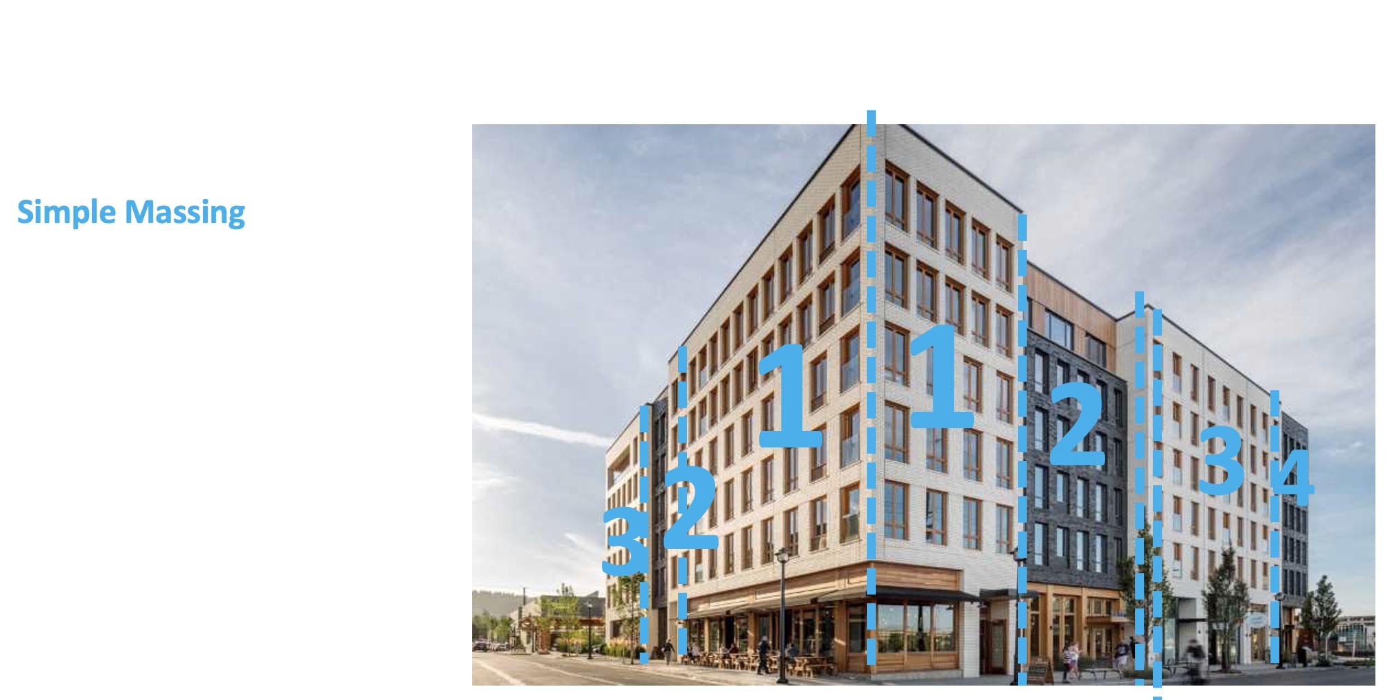
Simple massing that doesn’t try to replicate a city skyline in a single structure
Uniform application of quality cladding material such as brick
What we need to avoid:
Arbitrary Shapes

Overhangs & undercuts that create a topheavy appearance and dark spaces at street level.

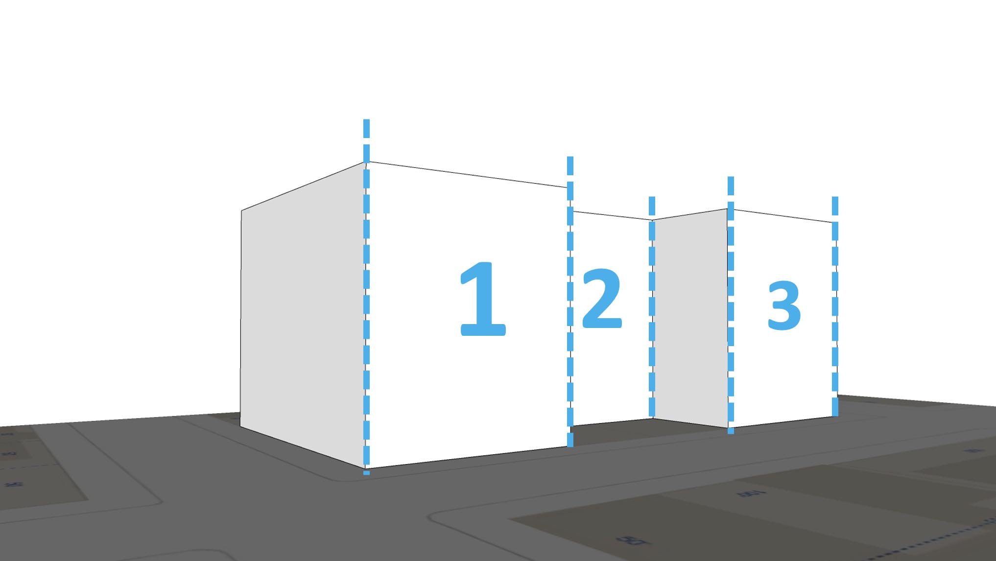
Attempting to recreate an entire city skyline in one building. WTF is going on here? Way to many materials, way too many shapes.

So let’s break down the elements of composition and look at some examples.
Simple, Tripartite Facade
Base/Middle/Top
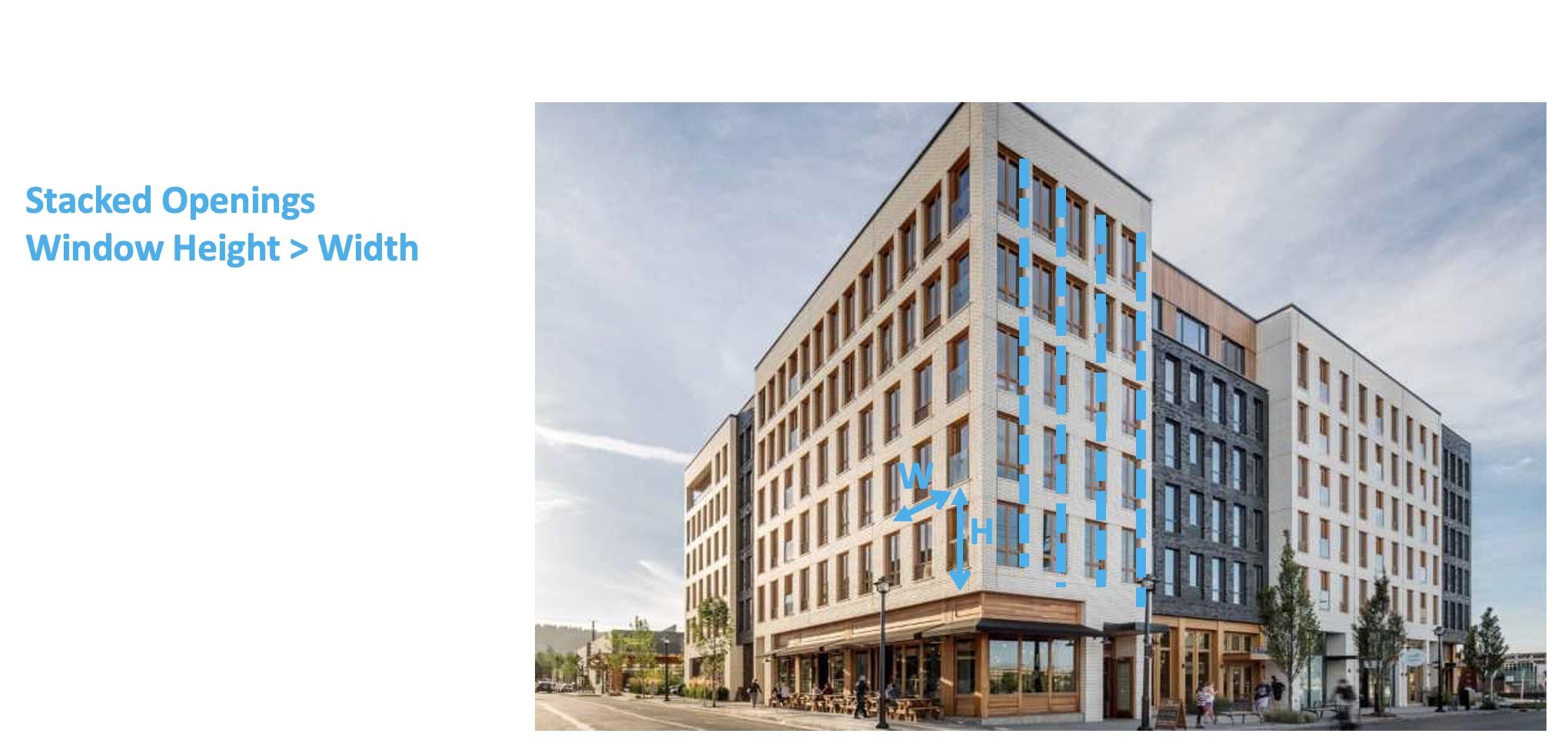
Vertically Aligned Openings
Window Height>Width
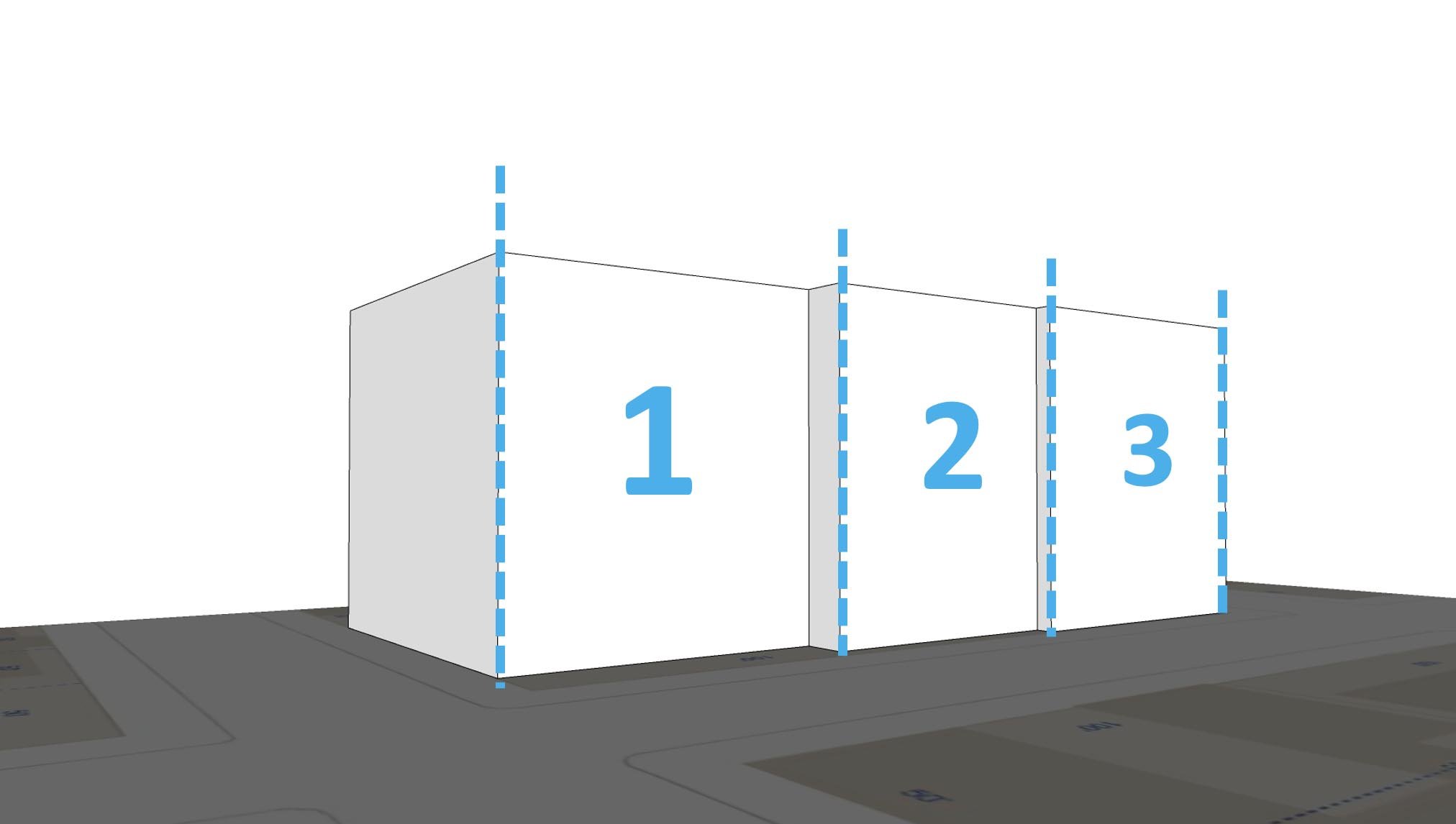
The rule of thirds in building composition can be found at least as far back as Vitruvius. The gist of it is that if you’re going to insert breaks in form and plane, it’s best to do it so that the building is basically divided into three primary masses. Further, each element on a facade should be about a third of the size of the bigger element it’s nested in, so a bay should be about a third of the wall plane it’s attached to, and so forth. Here’s three examples of how you could break horizontal articulation into three segments:

Vertical composition, similarly, has three elements, a base, a middle and a top. Think of a column; it’s got a base, a shaft and a capital. Likewise with the human body, so there’s an anthropomorphic element if you like.

Bands and cornices are a straightforward way of accomplishing this. You can also do it with changes in materials and/or colors.

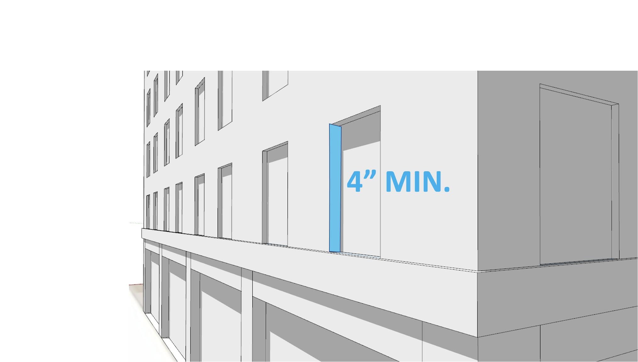
Have you ever noticed that modern windows make a building look cheap and insubstantial? This is because a common type, the nail flange window, is installed so that the glass is flush with the outside wall plane. Traditionally, windows are inset somewhat from the surface of the wall, allowing us to see the depth of the wall. The more thickness we can see, the sturdier the wall looks. Lots of contemporary buildings look like they’re only an inch or two thick.
The aspect ratio of the windows is important. Windows should be taller than they are high. There are good reasons why we expect this. It’s easier to span a short distance than a long one, so the narrower the window, the sense it makes structurally. Intuitively, we all know this. There is, once again, the anthropomorphic element too: we’re taller than we are wide, and a 6 foot high by 3 foot wide window gives us a sense of scale: when we look at a wall and see a pattern of objects that roughly scale to ourselves, we can easily read the size and proportion of the building.

And finally, the windows should be aligned vertically. Once again, this has to do with gravity. The load of a building transfers on to the floor or wall below, and you wouldn’t stack a wall of bricks over an opening. We understand this intuitively, so checkerboard window patterns seem off somehow. “Random” or “arbitrary” placement of facade features has been something of a fad in the early 21st century, but there’s little reason to expect it to have much staying power, and every reason to expect it will soon look as dated and foolish as the other trends we’ve mocked on this blog.

Here’s what you get when you put all these elements together:

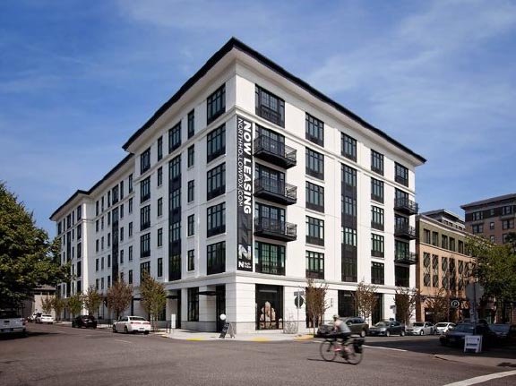
But don’t take our word for it. Here are some examples from recently completed buildings in Portland. This one is located in St. Johns. It does all the right things: stacked windows that are taller than wide. Three primary masses, a base, a middle and a top. One primary material on each mass. We could do with more of this.

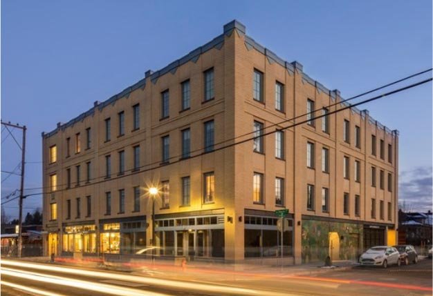
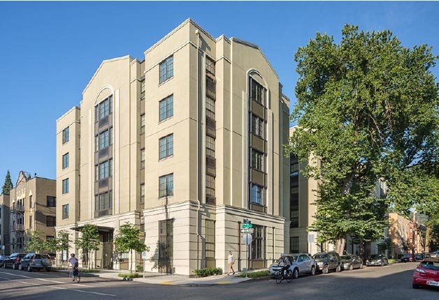
This example, the LL Hawkins building in Northwest is a lot bigger, but follows the same rules.

Let's break it down into the elements we've been looking at:

And as a reminder that these elements are not expensive, and in fact don’t impact the cost of building in any way, let’s observe the same elements on a recently constructed affordable housing structure in the Eliot neighborhood, the Songbird, on N Vancouver.


There are plenty more good examples to be found around town. Here’s one made with the cheapest of materials, EIFS, a material than is often associated with tacky strip malls and Taco Bells. Just follow a few basic rules of composition, and voila, it looks great. This building in Goose Hollow is a timeless, classic asset to the neighborhood.
And a few more from around town…


And lest we forget, here’s a reminder of what some of today’s architects might try, for the sake of ‘creating visual interest’ or ‘breaking up the box.’
