ReUrbanist Collaborative’s Irvington Dynamic Density Workshop

On a chilly Saturday in February a couple dozen neighbors gathered for a hypothetical experiment in community-led planning, under the auspices of a project called Dynamic Density, created by the team from ReUrbanist Collaborative - architect Rick Potestio and urban designer Jonathan Konkol (me).

What is Dynamic Density?

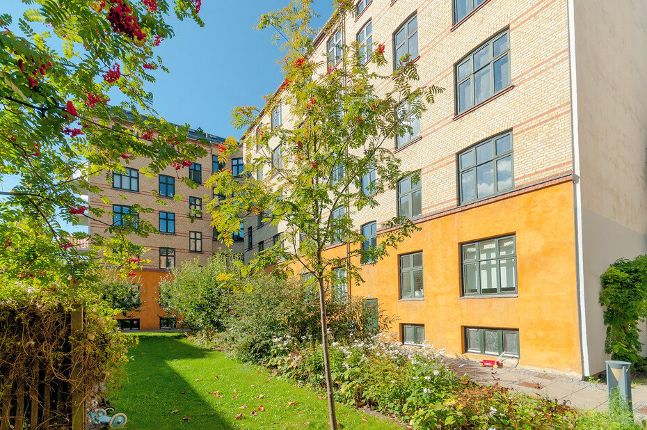
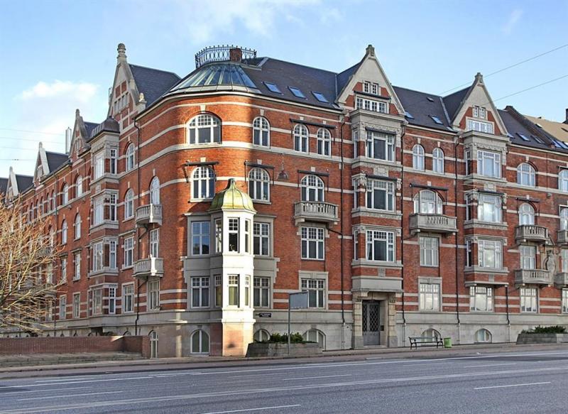
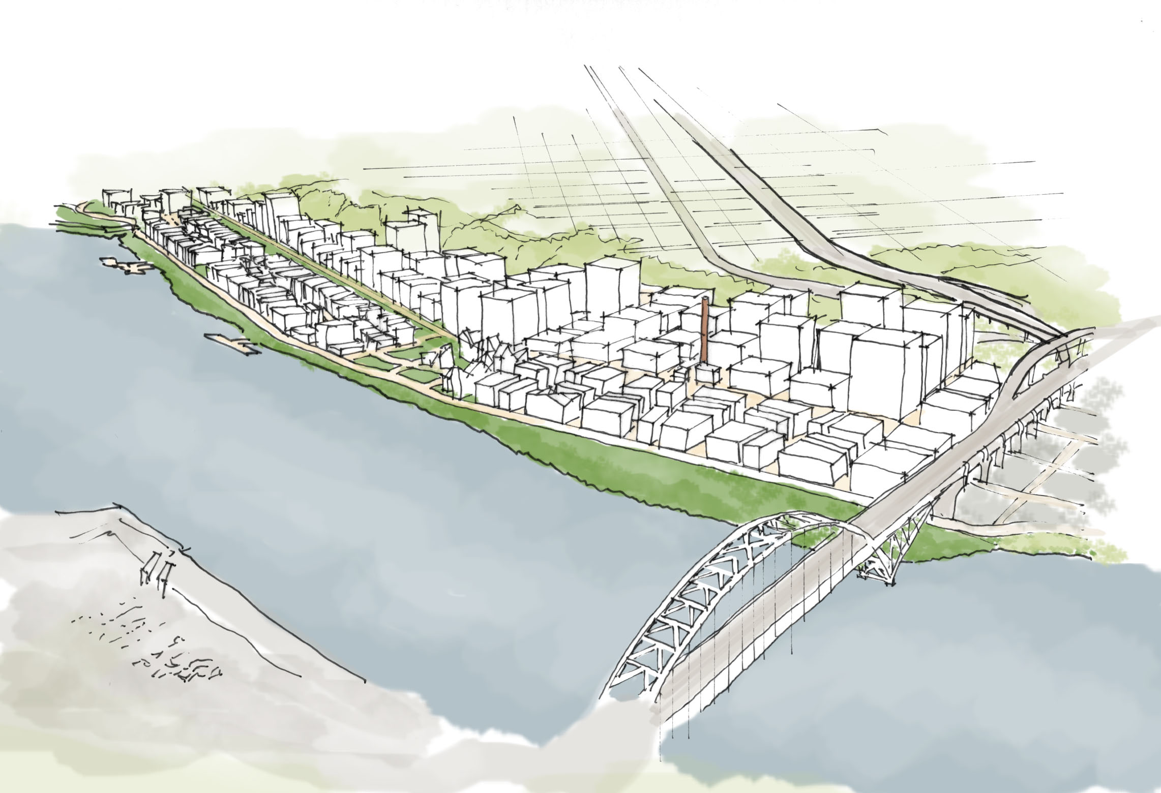
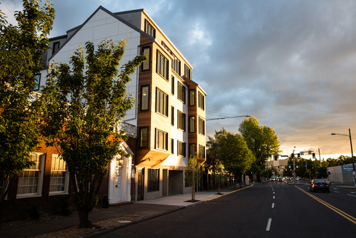
Dynamic Density was conceived as a tool for neighborhoods to use to allocate new housing in a context-sensitive way that benefits the community and offers a degree of control over the design of buildings. We have observed that many of Portland’s densest, and most desirable neighborhoods are a jumbled up mixture of single family houses, large buildings, and everything in between. Examples of this are Kings Hill, where Rick lives, the southern half of Irvington, where I live, and other places like Sullivan’s Gulch, Buckman, the Alphabet District, and others. These places took shape before modern zoning was established. 

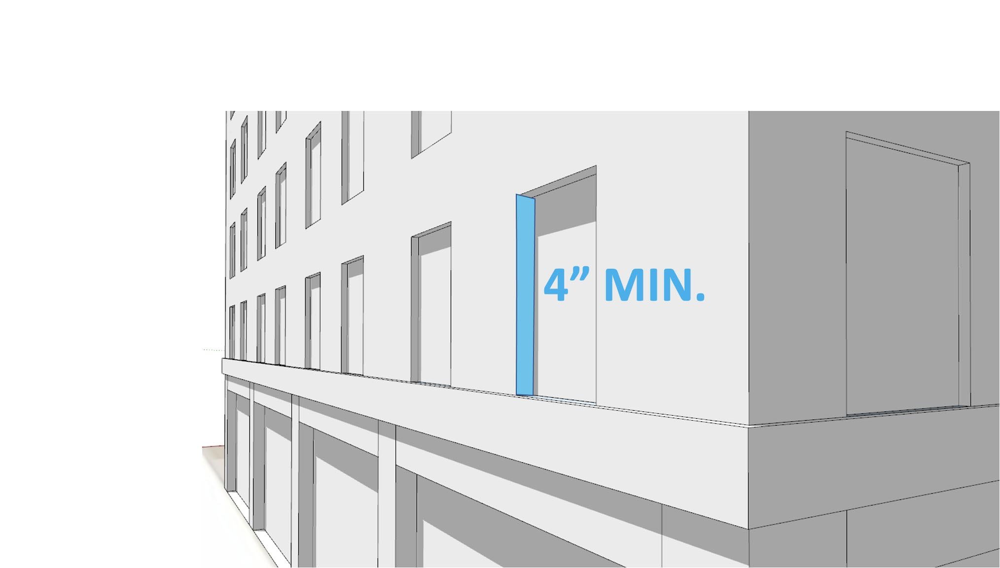
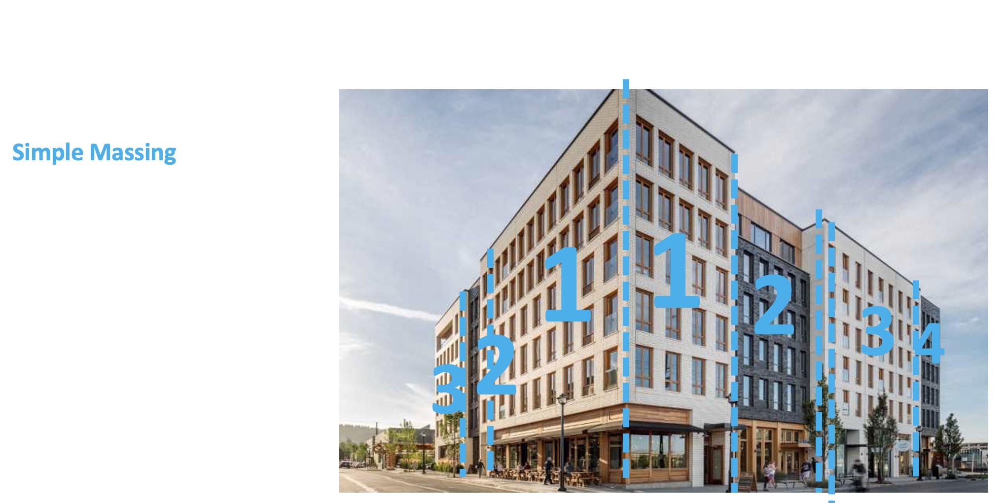
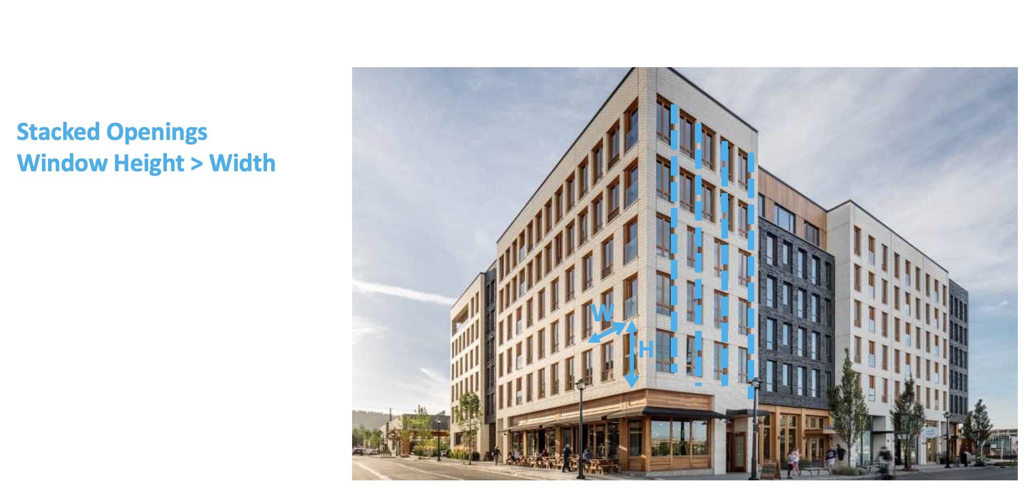
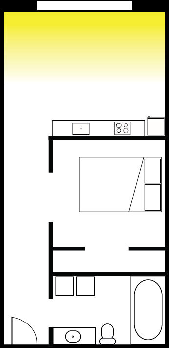
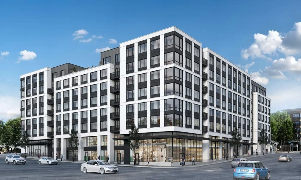
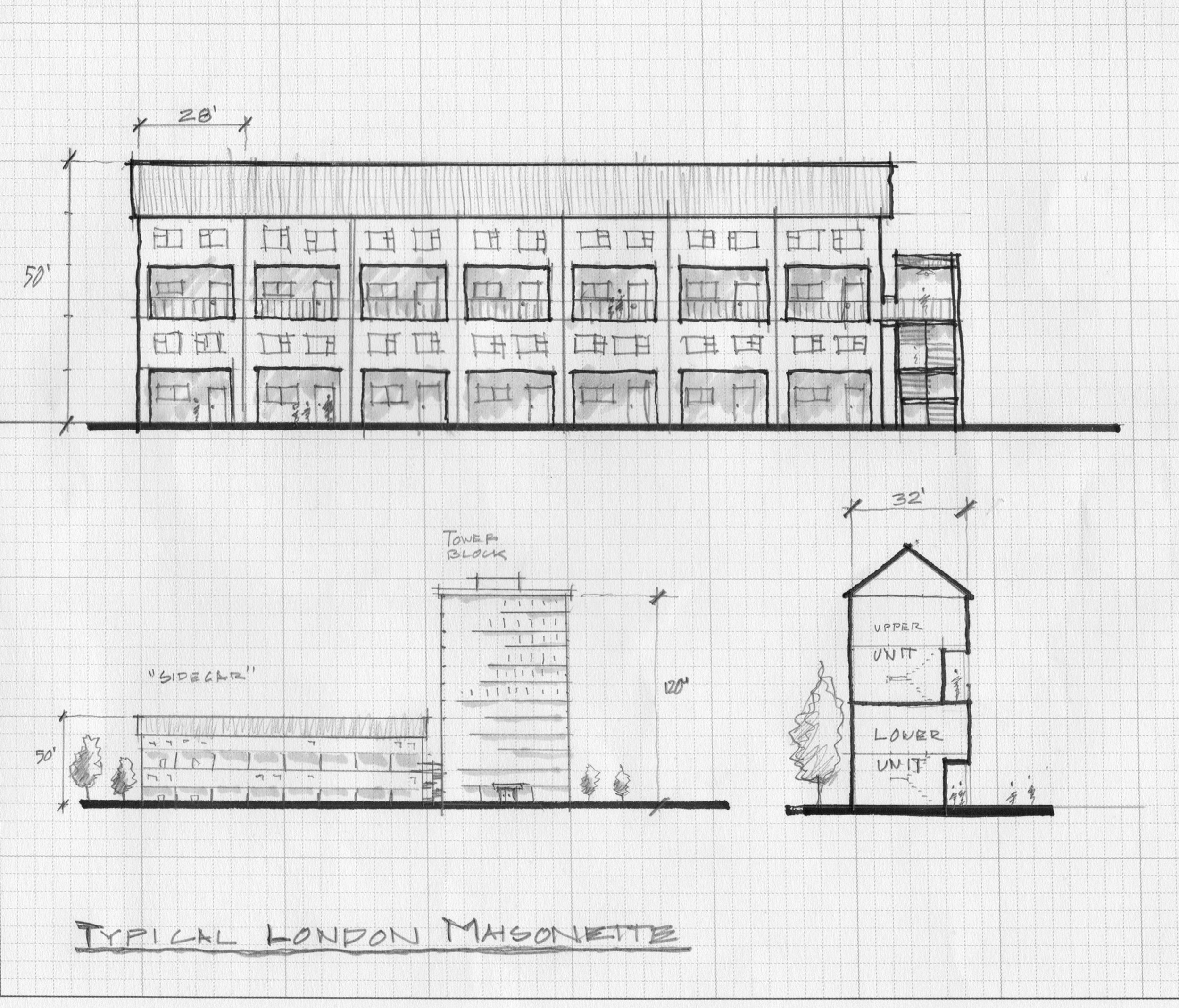
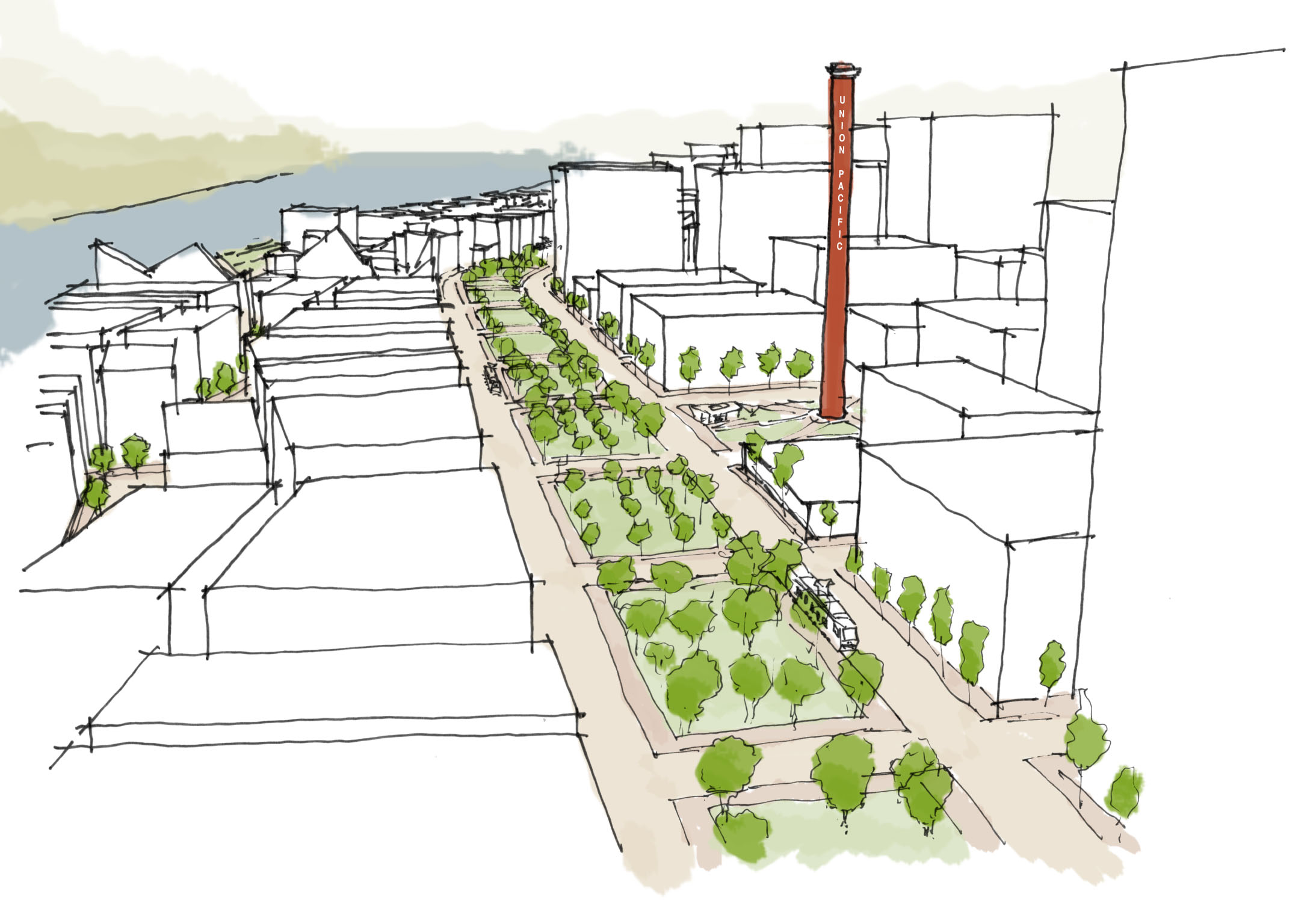
Under our system, neighborhoods would assess the existing blocks and buildings in their community and decide what buildings, trees, businesses etc. are extremely valuable to residents, and should be off-limits to demolition and redevelopment. The second part asks neighborhoods to find places for a specified number of new homes - each community’s share of anticipated growth - by allocating building types on the remaining properties. In order to ensure compatibility of the new housing with the existing neighborhood context, we provide a menu of pre-WWII multifamily buildings we have compiled from walking Portland neighborhoods with our cameras and tape measures. 

Why do we need to do this?

As most people are aware, Portland, like all west coast cities, suffers from an acute housing shortage, which has driven the cost of renting or buying a home out of reach of many people. As construction has not kept up with a growing population, people forced out of the housing market have ended up on the streets, creating a crisis that threatens livability for everyone. 

Meanwhile, Portland, once a success story for progressive planning, has been unable, or unwilling to do the hard work of planning how it will grow in the last couple decades, and now we’re dealing with the consequences. We have pushed new housing construction out to the edge of our urban growth boundary, into places that are nearly impossible to serve efficiently with transit, and congestion has consequently become an ever increasing problem. The governor and legislature have responded with blunt instruments that may have some short term benefits, but I believe, are profoundly short sighted and destructive; attempts to override our urban growth boundaries, and lifting development restrictions on existing neighborhoods without any attempt to preserve the qualities that made people want to live there in the first place. 

To be clear, the city as a whole is very low density and should accommodate many new, larger buildings. However, the planners’ approach does not address architecture or preservation at all, perhaps because it’s just too much work! We can do both, but it requires more sophisticated tools than our government is using. Dynamic Density is the tool we’ve developed to solve this problem.

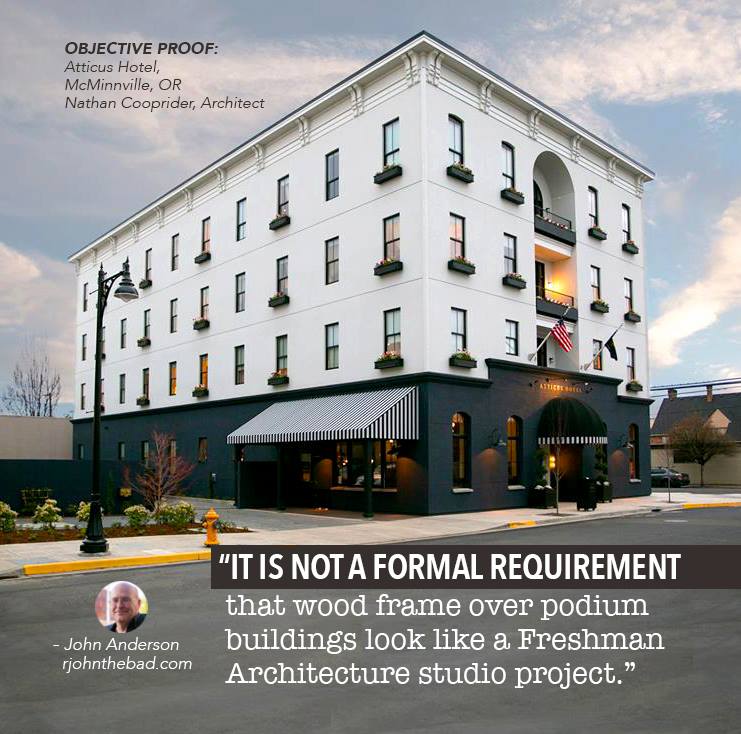
Speaking strictly for my own motivations, I have put countless hours into this project over the past five years out of a desire to find the best way to balance the competing imperatives to expand the amount of housing while sacrificing as few historic buildings as possible and without sacrificing the look and feel of our historic neighborhoods. From my experience studying and practicing architecture and planning, almost all NIMBYism is a perfectly natural reaction to the rubbish the architecture profession has generated in my lifetime. There are always good examples to be found, but at a gross level, people are right to be anxious about the quality of design to be expected of a new building, when an old one is knocked down to make way for something new. People, by and large, react to things that look ugly and cheap, and that is what my profession has been pumping out. 

What happened at the workshop?

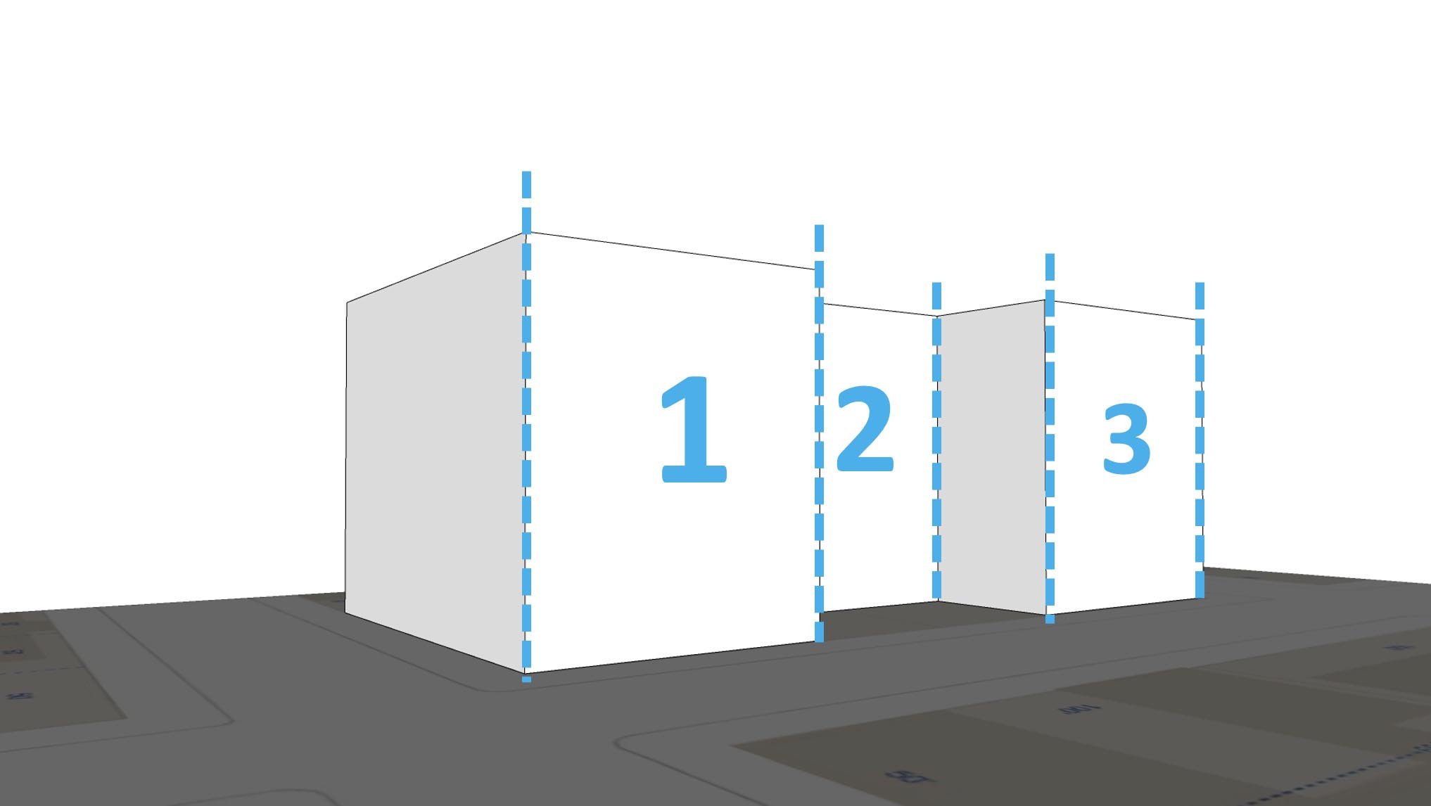
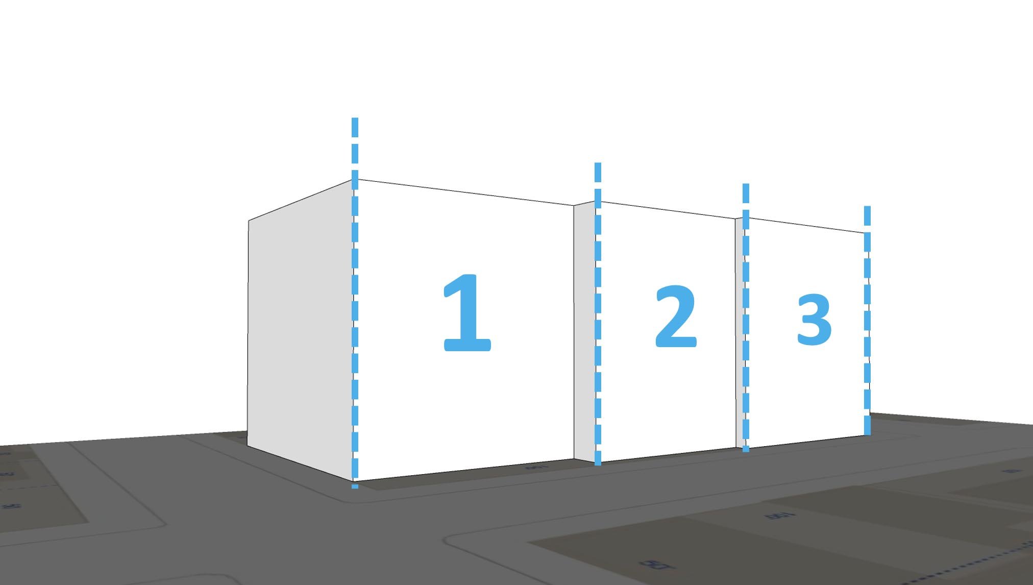
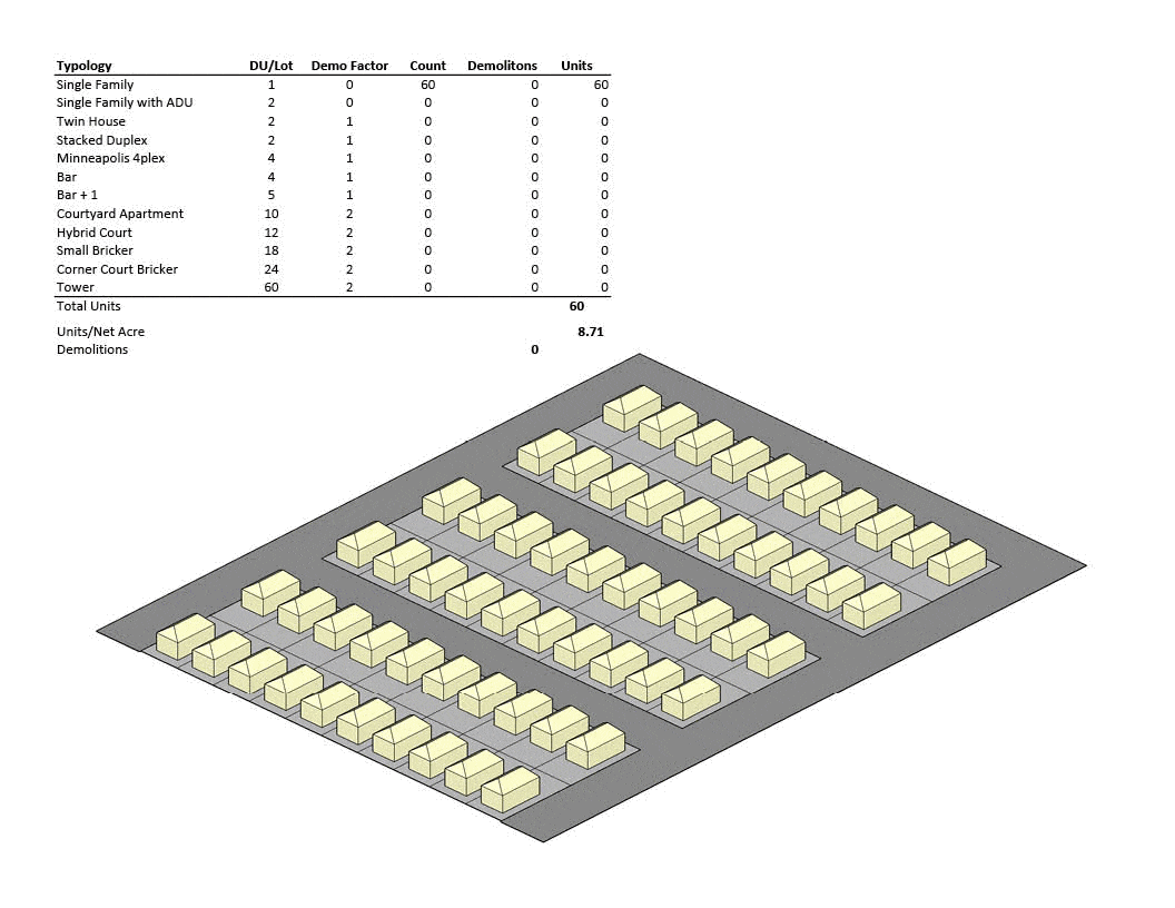
We divided the participants into three groups, all with 600 dwelling units worth of legos. Each group had a somewhat different task thought; each group had a different combination of bricks, representing different types of multifamily buildings. 

Team 1 was given mostly small buildings: duplexes, four-plexes and 8-plexes. Team 2 got a selection of medium density building types: four-plexes, eight plexes, brickers and a few L-shapes. The third team got a bag containing several towers, some L-shapes, and a few brickers. In many ways, the low density team had the most difficult task. They had by far the most buildings to find homes for on the map. By contrast, the high density team had far fewer decisions to make, though they may have been difficult ones. With the fewest buildings to place, they didn’t need to worry nearly as much as the other teams about what would have to be demolished to place their 600 units on the map. We also told this team that the lots fronting Broadway are off limits, as we’re anticipating new legislation will likely be aimed squarely at parcels with residential zoning, and Broadway is already zoned for 6-8 stories. In a more rigorous version of this exercise, we’d have placed this restriction on all the teams, but as it turned out most people intuitively understood that it would make no financial sense to place duplexes and fourplexes in locations where most such buildings have already long since given way to more lucrative commercial buildings and apartments, and zoned for more. 

Lessons Learned

This was a lesson in trade-offs. The approaches to growth posited by our three team scenarios offer a spectrum of alternatives, and selecting the right one for a given community entails balancing that community’s priorities. One can minimize changes in the scale of buildings - their bulk and height, or, one can minimize demolitions of existing buildings by keeping the footprint of change small and going up. Mathematically, one cannot do both. My personal bias is to preserve as many historic buildings as possible, so I prefer an approach that uses a few tall buildings, placed with some intentionality, to make room for new residents without sacrificing the non-renewable resource of historic buildings. Your preferences may vary, but the Dynamic Density approach offers us the tools to come to the best compromise we can manage, and to do so in an informed, democratic way. 

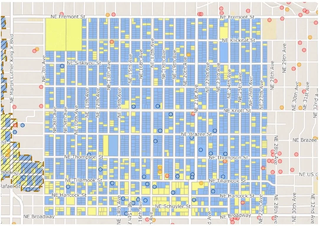
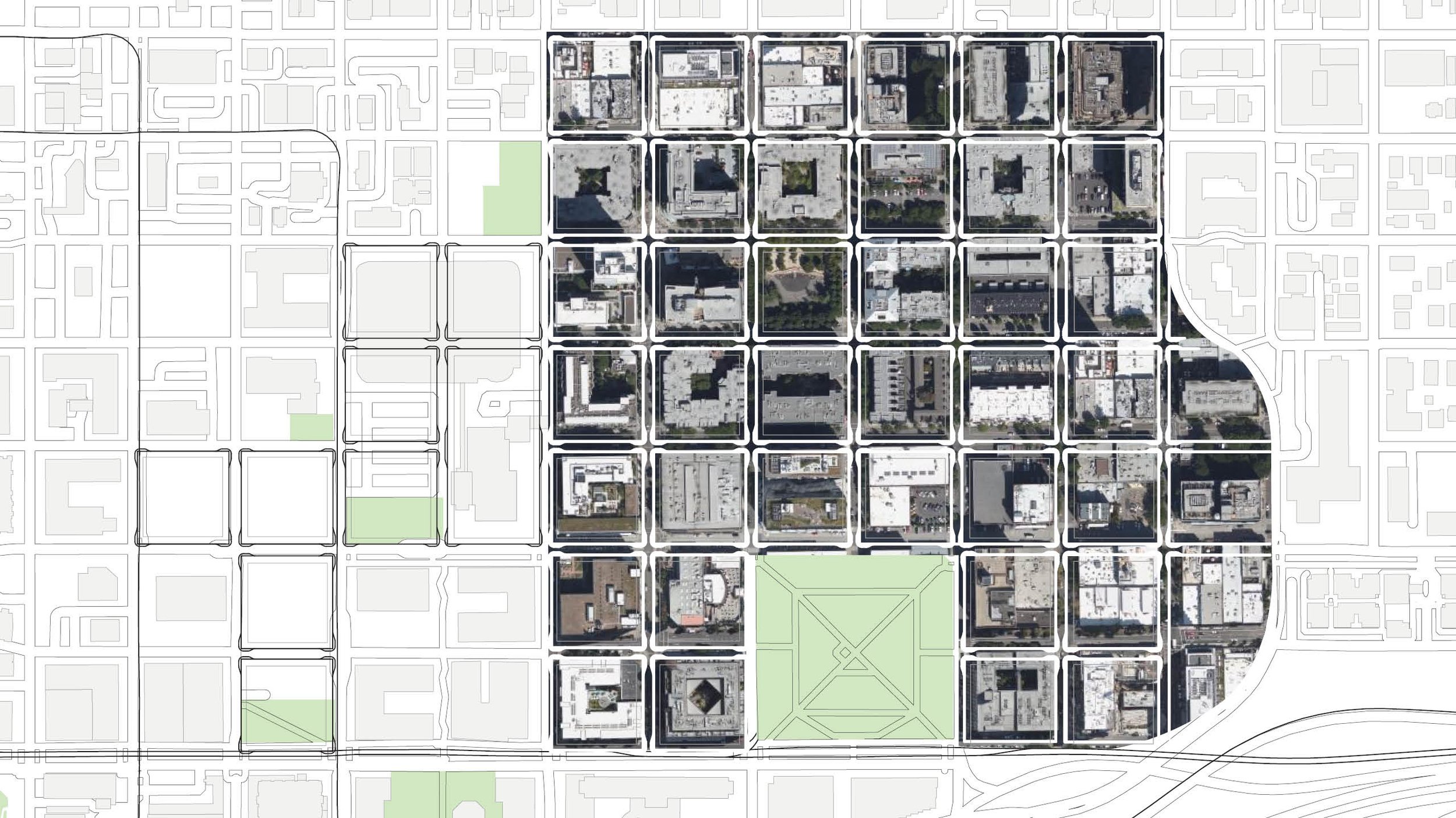
Irvington Historic District: Blue sites are contributing, yellow are non-contributing

The maps we used included color coding for the Irvington Historic District, indicating which buildings were classified as ‘contributing structures’ versus ‘non-contributing’ structures. This made it easy for teams to assess which buildings were of less historic and architectural significance. All teams generally opted to pick the low hanging fruit, preferring to sacrifice non-contributing buildings for denser new buildings to accommodate growth. We think this reflects a basic value most people place on historic buildings that define the fundamental look and feel of a neighborhood. In neighborhoods without such mapping tools already at hand, an exercise like this would likely need begin with teams of people fanning out into the streets with clipboards, and engaging in a process of developing their own list of contributing versus non-contributing structures. 

The low density team realized that market economics made their scenario least plausible. The combination of high land costs with low yield per site meant that duplexes and fourplex buildings would have to command very high prices just to break even. Therefore, in a high-value, close-in neighborhood like Irvington, that sort of upzoning would likely result in few new units being added. Moreover, the low density team’s challenge most closely resembles the direction in which state and local legislation is pushing us, and indicating that the current legislative agenda is probably not going to deliver the units promised. With that information, we can surmise that for most communities, some mixture of medium and high-density infill will be the most successful path to realizing our housing targets. This has the added advantage of preserving more existing structures, and limiting the disruption of the urban fabric. The outstanding question is how much height communities are willing to accept, when the alternative is greater numbers of structures demolished and redeveloped. 

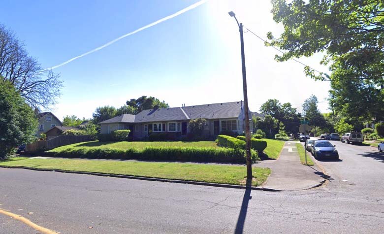
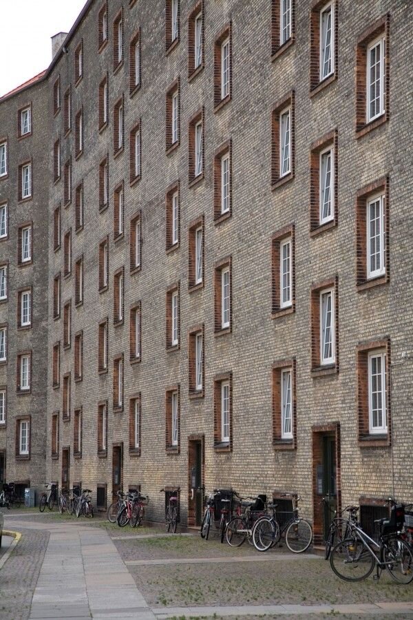
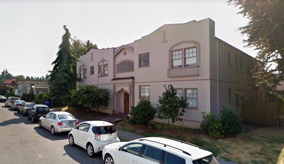
The tour visits existing fourplexes in Irvington

We also noted that there are problems that need to be solved with the way Oregon’s building codes regulate ‘missing middle’ housing. Under Oregon’s version of the International Building Code, any residential building with more than two units must comply with commercial code standards (as opposed to the residential code) which requires costly features like fire sprinklers and greater separation between units. This adds a lot of cost to a fourplex or a sixplex, and that cost is often enough to make smaller historical multifamily building types not financially viable to construct. This will require changes at the state level, and that will have to come from the legislature. 

Finally, and perhaps most significantly, the workshop demonstrated that the stereotype of single family homeowners, and those residing in historic districts, in particular, are knee-jerk NIMBYs who refuse to accept any change and disdain dwellers of multifamily housing is a lazy generalization that doesn’t reflect reality. As one of my mentors has said, “When given good information, communities will always make the right choices.” 

In my observation, people generally seem to react with skepticism if not outright fear of new development in their communities because they’ve been conditioned by the bad design my profession has foisted upon them for decades. People love the quality of the architecture and the feel of the streetscape in the neighborhoods where they have chosen to live. They are perfectly happy having neighbors in the pre-auto era multifamily buildings that have existed in Portland neighborhoods for over a century. If we can offer people tools to preserve the architectural heritage of their communities, benefit from growth and have a modicum of control over how it will look, they will make the right choice. 

 People understood the physical implications of different types of housing and also debated the economic and social aspects. If this were a real-life exercise, I am confident that highly considered and sound decisions would be made. The walking tour was very instructive in pointing out the very different and important characteristics of buildings that in policy terms are identical. The fact that garden court apartments and parking lot apartments can be seen as similar to a bureaucrat, but so different to a neighborhood’s character and social structure is a very significant realization for most people.  - Rick Potestio

I went to the meeting hopeful, but not sure that the project would be successful. Sometimes it is nice to be wrong.  The people who participated took the matter seriously and thoughtfully, and I thought "Yes indeed, this could work, and for sure it is a better system that the top-down zoning code regulations that are the standard in the United States. - Tony Greiner

The opportunity—and challenge—of density is all in the question of HOW it is done. Proponents of density cite examples of it being done well, and opponents cite examples of it done poorly. When cherry-picking examples, both sides are right—and wrong—and we get nowhere as a community. So, it’s incredibly important to move the matter of density from an abstract question to a specific one. What kind of housing? Where? For whom? How? This is what makes the difference from density being done well versus poorly, and this is what the exercise allowed us to do. Down to the individual plot and unit level we were thinking about how the system could evolve to map to our communities needs in specific, clear ways. It’s the kind of exercise that will help anyone who cares about community development and urban planning, and I’m grateful to Jonathan and Rick for making it happen, and the Irvington Community Association for promoting it, and the wonderful attendees for bringing their full selves to make the session a success.  - Caleb Bushner

Background Buildings 101

One of the lessons we’ve been attempting to illustrate with this blog is that good growth in cities, and evolution of neighborhoods works best when designs respect context and don’t try to stand out with short-lived trendy design cliches. We belive that most nimbyism is a natural reaction to conditioning of the public by the architectural profession to expect architectural atrocities when a new project goes up. It doesn’t have to be this way.

Background buildings are calm, quiet buildings that do their thing without screaming for attention - or yell fire in a crowded theater. What makes a city interesting is not a collection of novelty buildings with outrageous shapes, it’s the way the parts fit together and relate to the connective public space to make a harmonious whole.

We’re going to break down the basic elements of composition for a timeless, competent background building mid-rise multifamily building. A building that compliments its surroundings, rather than tries to one-up them with silly gimmicks.

One of the great things about the sort of timeless design we practiced until the postwar era is that it’s scalable. The basic way of composing a facade applies equally well on a single story or a 12 story building.

scalability

Overall Best Practices::

  • Timeless forms that avoid ‘fast fashion’ trendy design themes

  • Quiet background buildings that don’t scream for attention

  • Simple massing that doesn’t try to replicate a city skyline in a single structure

  • Uniform application of quality cladding material such as brick

What we need to avoid:

Arbitrary Shapes

Overhangs & undercuts that create a topheavy appearance and dark spaces at street level.

Attempting to recreate an entire city skyline in one building. WTF is going on here? Way to many materials, way too many shapes.

So let’s break down the elements of composition and look at some examples.

  • Simple, Tripartite Facade

  • Base/Middle/Top

  • Vertically Aligned Openings

  • Window Height>Width

The rule of thirds in building composition can be found at least as far back as Vitruvius. The gist of it is that if you’re going to insert breaks in form and plane, it’s best to do it so that the building is basically divided into three primary masses. Further, each element on a facade should be about a third of the size of the bigger element it’s nested in, so a bay should be about a third of the wall plane it’s attached to, and so forth. Here’s three examples of how you could break horizontal articulation into three segments:

Vertical composition, similarly, has three elements, a base, a middle and a top. Think of a column; it’s got a base, a shaft and a capital. Likewise with the human body, so there’s an anthropomorphic element if you like.

Bands and cornices are a straightforward way of accomplishing this. You can also do it with changes in materials and/or colors.

Have you ever noticed that modern windows make a building look cheap and insubstantial? This is because a common type, the nail flange window, is installed so that the glass is flush with the outside wall plane. Traditionally, windows are inset somewhat from the surface of the wall, allowing us to see the depth of the wall. The more thickness we can see, the sturdier the wall looks. Lots of contemporary buildings look like they’re only an inch or two thick.

The aspect ratio of the windows is important. Windows should be taller than they are high. There are good reasons why we expect this. It’s easier to span a short distance than a long one, so the narrower the window, the sense it makes structurally. Intuitively, we all know this. There is, once again, the anthropomorphic element too: we’re taller than we are wide, and a 6 foot high by 3 foot wide window gives us a sense of scale: when we look at a wall and see a pattern of objects that roughly scale to ourselves, we can easily read the size and proportion of the building.

And finally, the windows should be aligned vertically. Once again, this has to do with gravity. The load of a building transfers on to the floor or wall below, and you wouldn’t stack a wall of bricks over an opening. We understand this intuitively, so checkerboard window patterns seem off somehow. “Random” or “arbitrary” placement of facade features has been something of a fad in the early 21st century, but there’s little reason to expect it to have much staying power, and every reason to expect it will soon look as dated and foolish as the other trends we’ve mocked on this blog.


Here’s what you get when you put all these elements together:

But don’t take our word for it. Here are some examples from recently completed buildings in Portland. This one is located in St. Johns. It does all the right things: stacked windows that are taller than wide. Three primary masses, a base, a middle and a top. One primary material on each mass. We could do with more of this.

This example, the LL Hawkins building in Northwest is a lot bigger, but follows the same rules.

Let's break it down into the elements we've been looking at:

And as a reminder that these elements are not expensive, and in fact don’t impact the cost of building in any way, let’s observe the same elements on a recently constructed affordable housing structure in the Eliot neighborhood, the Songbird, on N Vancouver.

There are plenty more good examples to be found around town. Here’s one made with the cheapest of materials, EIFS, a material than is often associated with tacky strip malls and Taco Bells. Just follow a few basic rules of composition, and voila, it looks great. This building in Goose Hollow is a timeless, classic asset to the neighborhood.

And a few more from around town…

And lest we forget, here’s a reminder of what some of today’s architects might try, for the sake of ‘creating visual interest’ or ‘breaking up the box.’

Lloyd District Reboot

Photo by u/pnwmommy on Reddit

We decided to take a look at a possible future, for Portland’s perpetually undead Dead Mall, the Lloyd Center. A lot of proposals have been put forward, some serious, some silly. It’s our frank assesment that the mall itself has outlived its useful lifespan, and the opportunity cost of trying to repurpose the structure is just too high. What we mean is, it could be adapted for some other use, but by doing so, we foreclose all the other possibilities that arise from demolishing it, and the missed opportunity is worth more than any efficiency from keeping the carcass on life support for another generation. You know the phrase, ‘leaving money on the table,’ in reference to a deal where you don’t get all you could for something. Well, in this case, the ‘money’ is housing where it’s needed most, and a great urban neighborhood, where there’s underused relic of mid 20th century car culture and consumerism.

Existing mall and vicinity

We didn’t come up with any wild ideas here, or even particularly exciting ones. This is a sort of baseline capacity study, to see what, at a minimum, could be achieved if the city grid grew back where it once was, and the blocks filled in with midrise development appropriate for a central city location adjacent to downtown and high capacity transit.

Here’s the existing development pattern. Note how out of scale the footprints are with the surrounding urban neighborhood. This is big pixel, low resolution urbanism.

But if the street grid were to heal over the wound, there’d be some major opportunities for a granular, walkable neighborhood to grow.

Finally, we grabbed an aerial of the equivalent number of blocks from the Pearl and dropped them in. The shift in scale is stunning.

These blocks, representing the core of the mall and its immediate vicinity could make a significant dent in our housing shortfall. If the area were to follow the development pattern of the Pearl District, averaging around 200 dwelling units per acre, it could easily accomodate 7,000 new apartments, and become home to somewhere upwards of 11,000 people! If the pattern were extended west towards I-5 those numbers could be doubled, and all this could be accomplished without the sacrifice of any historic buildings or residential displacement (the handful of existing apartments near Broadway and Weidler would not need to go).

Why not Incrementalism?

Lloyd+Axon+Drawing+Painted.jpg

After many years in development and millions invested, the proposed mixed use redevelopment of the Lloyd Cinemas parking lot died with a whimper last fall. The abrupt failure of the nearly 700 unit development highlights the inherent risk of these megaprojects.

1510_ne_multnomah_dz3_img_40.jpg
1510_ne_multnomah_dz3_img_03.jpg

The fancy renderings presented at a series of design review hearings showed a large instant neighborhood, with meandering internal pathways. Holst did a pretty decent job of making it look as good as possible. The view from the street looked like a whole district, with many buildings, sort of like how we think of a neighborhood. In reality, this was all one colossal development, and the simulacrum of diversity belied a monolithic reality. That becomes clear when one examines the site plan.

1510_ne_multnomah_dz1_dwg_03-1024x663.jpeg
1510_ne_multnomah_dz1_dwg_01-1024x663.jpeg

What appear to be a group of separate buildings that coalesced organically is actually a group of megastructures and assorted accessory structures. This isn’t to say that we should never allow this to happen. Some master planned projects can create a quality place, when executed skillfully.

1510_ne_multnomah_dz1_dwg_05-1024x663.jpeg

This way of building is, however, an anomaly in the history of human habitation. While Popes and Caesars had the power to reshape districts, almost all building in cities has been incremental and small scale in nature. Until the rise of corporate investment banking, only the church and the crown had the power to build this way. The development of Portland was no different. Indeed, the Lloyd district’s own history is one characterized by the volatile and failure-prone nature of megaprojects.

Most of our city was developed on a grid system made up of modules of 50x100 foot lots. It’s far easier for a small local developer to purchase one or two of these and put up a modest building. Indeed, that’s mostly how Portland was built. When lots of parcels are consolidated, only the big national builders, fueled by institutional capital can compete.

Increments.jpg
Cinema parking aerial.jpg

This post asks a simple question, why not try a more organic, incremental approach to properties like this? Instead of putting all the eggs in one basket, what could happen if a master developer parceled off a big block like the Lloyd Cinemas site and sold it off in small lots. A developer can buy one, two, or more, according to their ability and ambition. When the minimum buy-in is lower, the initial barrier to entry is reduced and the chances of something happing right now are much higher. For our little experiment, we decided to keep it simple, so we simply resurrected the underlying plat. These are the modules that were consolidated to make the current superblock:

Original Plat Yellow.jpg

Here’s what that incremental buildout could look like. A few small projects start things off, and as value grows, bigger, more ambitious projects fill out the space resulting in a mix somewhat similar to the southern part of neighboring Sullivan’s Gulch. You might have to play some games with the incentives in order to get some real diversity, like offering incentives to early adopters and small local players. We think it would be worth it though.

Lloyd Animation.gif

Developing this way produces a more organic, adaptable and resilient urban fabric. Individual parts and pieces can turn over on their own lifetimes, and a diverse array of investors and builders on this scale will foster more local participation, rather than sucking out the profits and funneling them out of state. One can imagine the potential of gradually returning the entire district to a human scaled grid resembling what might have developed had the place never been consolidated in the first place. We’re not suggesting this is necessarily the best, or the only way to reurbanize Lloyd and places like it, but we think it deserves serious consideration.

Lloyd Axon Drawing Painted.jpg

I was in the right place, but it musta' been the wrong time...

Juxtaposed.jpg

Here’s a case of two recent residential infill projects that neatly demonstrates several flaws in the way we think about plan for new middle scale buildings.

5 row angle.jpg

Case 1 is located about 100’ east of MLK Jr. Blvd. On paper, this building is doing what middle scale zoning should – providing a step-down transition between the midrise apartment zone (which happens to contain a brand new 5 story apartment building in this case) and the single family homes to the east. To be honest, it’s not even failing at that task per se. We like this building for a number of reasons. Its vernacular profile and consistent and calm architecture is timeless and skillfully executed. It presents a symmetrical, legible front to the street, and does not go through odd contortions to accommodate garages. It comprises five identical row houses in a line perpendicular to the street. The only complaint here is that this bread loaf loads its slices from doors facing the long side, which is an interior lot line. We’ll have more to say on this in a bit…

5 row .jpg

Our other case, located about 500 feet east, is on a corner site, with the outer side lot line facing Irving park. There’s not much positive to say about the architecture here.


duplex.jpg

This mess of arbitrary shapes and pointless rectangles is configured as a side-by-side. The building itself is extremely awkward. It’s three stories tower over its bungalow neighbors, due to the fact that its ground level is dominated by garages. This is one of those buildings were parking dominates and living space is shoehorned in around it. The two units suffer from the “floor is lava” problem, where the main living space is far enough from the yard that they have minimal connection to it. Unsurprisingly, the yard is just a patch of beauty bark surrounded by a 6’ “privacy fence,” Interspersed with posts that support stairs and decks for the levitating house above.

Beauty Bark.jpg

The gist of this post is that zoning orthodoxy instructs planners to put the “most intensive uses” along arterial streets, where there is high traffic (car and foot) and frequent transit. So far so good. The logic fails when we look at what this really produces. Broad brush zoning application doesn’t take things like Irving Park into account. Nor does it do much to relate bulk and height to the supposed intensity of a use, which, in residential areas, is simply measured in terms of number of units.

Wouldn’t it make more sense to have the taller of these two buildings between homes and mid-rise apartment blocks? Wouldn’t it make more sense for the side entry building to be on a lot where those entries can face the street, or better yet, a street with a big park on the other side? There’s precedent for the latter only a couple blocks away! Here’s a bungalow-bar type fourplex facing Irving park, with its entries facing the long side of its corner lot. How hard is this to figure out? The precedent is right fucking there, 200 feet away!

Precedent.jpg

The big idea behind form-based codes is that the form factor of the building is more important than the internal configuration, since that determines compatibility.

5 row doors.jpg

This nice row of front doors seems kind of wasted here. Wouldn’t it be better to have these lined up facing Irving Park across NE 7th? Compare:

duplex vs 5plex 1.jpg
duplex vs 5plex 2.jpg

Keep it Simple!

Last night, over a few glasses of wine, PDXplore got architect and agitator Rick Potestio’s take on DOZA. We wrote our top asks for this document, which boiled down to 9 bullet points. Rick’s take was even simpler. We’ll try to paraphrase it here to the best of our recollections:

 There’s downtown, and there’s everything else. Our commercial streets are the connective tissue that joins all the diverse parts of Portland and unifies it as a city. We are going to have mostly residential and mixed-use buildings along those streets. Because of the way buildings work internally, you’re going to have a ground floor that’s taller, a bunch of floors on top of that and a penthouse. This gives you a base, a middle and a top. Any material changes should just be to express that. In order to avoid total chaos, buildings should have symmetry and windows should be stacked so they all line up. Material pallet should be a warm organic one. It doesn’t even force you into a specific style. If you want to be modern, be modern within that framework. All the great architects were able to make buildings within those constraints. Mies could do it, Alto could do it, we can do it.

Even if we elaborated on this, it could be done in one page. That’s all you need!

Rick Profile Pic.jpg

Perimeter Blocks

In this post we’re going to take a look at one of the residential typologies we experienced in Denmark, the Perimeter Block. They are fairly common in many northern European capitals, and we’ve seen something similar in places like Sweden and Germany. They are the foundational residential architecture of Copenhagen and typify the city more than any other city.

Exterior+photo.jpg

One of the first things one notices in Copenhagen is the rather large, uniform blocks in many central neighborhoods. Above is park in Vesterbro, which is mostly late 19th and early 20th century construction. Here is the same area, viewed from above:

Aerial.jpg
Aerial Axon.jpg

As you can see, what looks like a massive, solid block from the street is actually quite a slender structure with a large void in the center. From front to back, these buildings are typically about 36 feet thick or less. This creates a large central courtyard which enjoys ample air and light.

Big Axon.jpg

The reason the buildings lining the courtyard are so thin is that they are only one unit deep. That means that each unit has two window-walls, one facing the street and the other facing inward to the courtyard.

Rendered Section.jpg
Rendered Elevation.jpg

This configuration is possible because instead of a single entry and a central corridor, these units are in stacks that share a central staircase. Each “front door” typically serves no more than 10 families.

Rendered Section and Plan.jpg

Often a second back stair provides access from kitchens to the courtyard side of the building. The generous size and shape of units makes them ideal for families. Most importantly, the through-building format of the stacked units allows them to function like a house in terms of daylight and cross-ventilation.

Air and Light.jpg

While the outsides of the blocks can seem at times hard and dreary, the interiors are a green oasis.

The central courtyard creates places for children to play outside their apartments in safety. They also allow for gardening, bike sheds and general relaxation for the residents of the block, who essentially share their own private park.

courtyard-wide-600.jpg

The biggest downside of the perimeter block is that in some cases, they can be monotonous and grim from the outside.

gloomy boliger.jpg
variety.jpg

In older neighborhoods, the perimeter building was not a single building, but a series of segments joined together to create a perimeter block. The inherent variety livens things up. Different colors, materials, and often, even different floor heights provide variety. Buildings of different ages and conditions foster diversity.

block variety.jpg
fancy block.jpg

Better designed blocks eliminate this by creating detail appropriate to the scale of the building. Note the “rule of thirds” hierarchy, where every element is approximately one third the scale of the larger element it is nested within.

The perimeter block is alive and well today. We found some very exciting examples in the new urban Sluseholmen neighborhood in the Sydenhavn district. Built on former industrial docklands, the area’s perimeter blocks are bounded not only by streets, but a network of canals.

sluseholmen_ark031108_ebbeforup_1.jpg
sluseholmen2.jpg
sluseholmen.jpg

By contrast, the typical American apartment building format provides a primary entry and access to units via a central corridor, like a hotel. There is an advantage of efficiency, since a few stairs and elevators can serve an entire building. However, the building itself becomes much thicker from front to back and most units end up having only one outside-facing wall

American Prewar Building.jpg

In a typical pre-war apartment building, unit width was greater than depth in order to maximize daylight. In environmental design, the area of a room that is considered “daylit” is defined as the height of the top sill of the window x 2. So if the top of the window is 7 feet off the floor, then 14 feet inboard of the window is daylit.

American Prewar Unit.jpg

If this situation had some drawbacks, the status quo in the industry today is exponentially worse. In recent years (perhaps 2 decades or so), large developers realized that they could maximize leasable space by turning the units sideways so that the short end faced the outside. This resulted in the default configuration of contemporary urban apartments; long narrow units with daylight at the “end of the tunnel.” This configuration maximizes efficiency and generates the most bang-for-the-buck for investors.

American Contemporary Building.jpg

This is accomplished by making a bedroom that is not quite a legally-defined room, and therefore needs no window, and eliminating the kitchen as a separate room, moving it onto a wall in the living room. As a result, we end up with a long dark unit. This type of building is really only suitable for small households. To the best of our knowledge, this double-loaded hallway building configuration is not allowed for apartment buildings in Denmark.

American Contemporary Unit.jpg

The double-loaded central hallway configuration can pack up to140 units per acre, compared to the typical Danish courtyard building which averages 60-70 units per net acre. That’s a lot lower, but for comparison, a typical single family block in Portland has a density of about 9 units per net acre.

modera_morrison_dar2_img_01-1024x612.jpg

Very large American apartment buildings like this one proposed for SE Belmont fill whole blocks, but unlike their Danish counterparts, they maximize the economic output of the building system while providing a unit type that is not very adaptable. We’d argue that while the American system is good for investors, and helps cities achieve short-term goals of reducing the shortage of dwelling units generally, the type and usability of these units is probably less valuable for the long-term stability and sustainability of an urban neighborhood.

Brit Boxes: The Maisonette Typology

Maisonette Sketch Diagram.jpg

On our travels in the UK we discovered types of buildings we’d never seen before. Some great, some not so great, but all fascinating and eye opening - proving that there are many more ways to build that what we’re familiar with. Today we’ll introduce a new typology we’ve never seen in the Western US; the Maisonette. These are basically a row of townhouses stacked on top of another row of townhouses.

Most of the time we encountered these on Council Estates - public housing owned by the London County Council. At its mid-century peak, about half of all English citizens lived in publicly owned housing and much of this post-war legacy remains. In many cases, we found a configuration of small-footprint tower (typically four units per floor) combined with a low-rise “sidecar” of one or more rows of maisonettes. This created a nice variety of tall flat blocks with breathing room and tree canopy around them.

Maisonette+Axon.jpg
Rows of Maisonettes.jpg
Street in the sky.jpg
Sidecar.jpg


Cream Brick.jpg

Scheißehaus

We’ve noticed this house popping up on sites all around the city, from Division to Alberta, much to our chagrin. In an homage to our favorite blog, McMansion Hell, let’s take a look a this ugly Frankenstein hot mess of a building.

Shit Haus

Shit Haus

This ridiculous pile of garbage is exemplary of why a lot of Portlanders are deeply suspicious of things like the Residential Infill Project. We suspect that if there was any architect involved in this design, it was the sort of architect who spent all their history lectures looking at Facebook on their phone. There’s no coherent design idea here, just a bunch of material samples a realtor might have grabbed from Pinterest and stitched together to make a structure.

Nobody complains about “cookie-cutter” when the cookie tastes good.

Nobody complains about “cookie-cutter” when the cookie tastes good.

This sort of “architecture” passes for “modernism” though it’s really anything but Modern with a capital M. The modern movement’s axiom of form follows function is parodied here with pointless forms that serve no function. There’s nothing intentional about this, just a superficial copy of the most trivial aspects of actual modernist design. Long story short, a bunch of random rectangles composed in an asymmetric pattern (actually kind of difficult when you’re building a mirrored townhouse).

Of course there’s always someone who’s prepared to step up and defend the indefensible. Their argument usually amounts to “but muh freedom” or something like that. Let’s be clear, these arguments are usually pretty disingenuous and come from debate-club wankers who delight in contrarianism because it’s fun to wind people up and have a laugh.

And, of course, if you designed this and you meet us on the street, please, not the face!

This is not so much a cookie as a shit sandwich

This is not so much a cookie as a shit sandwich

Dynamic Density - The Board Game!

What if we could preserve what we love in Portland’s classic neighborhoods while creating opportunity for tens of thousands of new households in the coming decades? What if historic preservation and affordability advocates could find themselves on the same side, on the same team? Let’s imagine a future where neighborhoods are partners in growth and change, playing a collaborative role in finding room for new homes for our growing population.

We believe the answer could lie in give neighborhoods a snapshot of what their current population density looks like and facilitate a process of visualizing different ways to meet or exceed a density target using historical prototypes like the ones we’ve documented in our case studies. We can lead neighbors in a series of public design meetings

Modular Density Optomized.gif

The Dynamic Density process empowers neighborhoods to direct how they would like to grow, and enables them to share in the economic benefits of development in their communities.

The Dynamic Density process recognizes the inherent value of Portland’s classic neighborhoods and empowers citizens to take an inventory and preserve what they love. This includes historic houses, but also trees and other non-development features

By establishing each neighborhood as a Community Development Corporation under the auspices of a Prosper Portland designated micro urban renewal district, neighborhoods will be able to capture a portion of the System Development Charges (SDC’s) new tax revenue generated by that development.

Community Choices Diagram Updated.jpg

So while our leaders talk about kneecapping neighborhoods, instead, let’s change the game. Let’s give neighborhoods an incentive to upzone themselves using their own local knowledge and priorities to do so in a way that’s right for them.

Albina Yard - A new urban frontier?

Photo: Oregonlive.com

Photo: Oregonlive.com

Last winter we started hearing things about a plan to move Union Pacific’s Albina Yard from its location on the bank of the Willamette below the Overlook neighborhood and redevelop the property for urban uses. Last month, we finally caught up with Mohammed Baddredine, the visionary behind the initiative. We were really excited about this and decided to take Mo’s work as a starting point for some visualizations of how an urban neighborhood could develop here. We drew inspiration from the new urban districts we’ve visited in northern Europe where obsolete port facilities from Manchester to Rotterdam to Malmö have been reclaimed as vibrant neighborhoods.

Isberjet, Aarhus, Denmark

Isberjet, Aarhus, Denmark

Västra Hamnen District, Malmö, Sweden

Västra Hamnen District, Malmö, Sweden

Our concept starts starts with a grid of 200 by 200 foot blocks, following the pattern of downtown Portland.

Looking north from the Fremont Bridge

Looking north from the Fremont Bridge


In order to improve circulation, we propose adding a new bridge - we suggest dedicating it to the late Portland author, Ursula K. Leguin. It would cross to the north of the Terminal 4 site, which has been proposed as the site for a Major League Baseball park.

General Site Plan

General Site Plan

Looking south over the Overlook neighborhood, Terminal 4 at upper right

Looking south over the Overlook neighborhood, Terminal 4 at upper right

We created over seven acres of new parks within the site, in addition to upgrading the Willamette river bank for more useable open space and habitat. The centerpiece is a spine of park blocks that runs the length of the site. Additional plazas and parks are provided including one dedicated to a new K-6 elementary school.

Park & Open Space Concept

Park & Open Space Concept

Proposed neighborhood school

Proposed neighborhood school

Looking south toward downtown, park blocks in the foreground

Looking south toward downtown, park blocks in the foreground

A spur line of the Max Yellow Line would run along either side of the park blocks, adding three new stops. All portions of the site would be within a quarter mile of a stop. This 1.3 mile line could potentially extend an extra 3/4 mile north to serve Swan Island, which is a major employment center.

Light Rail and Stations with quarter mile catchment areas

Light Rail and Stations with quarter mile catchment areas

We located primarily residential blocks closest to the river. These blocks would allow limited commercial uses but would consist mainly of homes. The rest of the northern portion would be mixed use with a focus on employment; office and light industry/fabrication. Housing and hotels would be permitted here. The southern commercial area would have a similar profile, but would allow much more intensive development.

Land Use Concept

Land Use Concept

These proposed patterns are reflected in the district’s height limits. These limits are also designed to avoid disrupting views of the river and Forest Park from the plateau above.

Height Limits

Height Limits

Residential areas deserve special attention, creating blocks that foster slow movement, pedestrian circulation and public spaces conducive to social interaction.

Residential Block Concept

Residential Block Concept

Finally, we feel it’s important to preserve and showcase the iconic chimney, a landmark and testimonial to the area’s 19th century industrial past.

Facing north, with preserved Union Pacific chimney

Facing north, with preserved Union Pacific chimney

Here’s our model, by the numbers:

calcs.jpg

Golf Courses and Green Spaces

watercolor.jpg

Over the last week, news stories in The Oregonian and the Portland Tribune have raised the issue of Portland’s public golf courses’ financial insolvency. It so happens that we’ve been mulling over the idea of redeveloping these properties for some time. As golf declines in popularity, redevelopment is becoming increasingly attractive to cities nationwide.

All else being equal, we’d rather not see these places change. But larger forces are gathering and so we’re putting this proposal out there to frame the inevitable discussion around the things we believe are necessary to preserve livability: visual continuity, public ownership, tree preservation, public green space, and of course, beauty.
20160526_aerial_final_less.jpg

Just looking at the numbers, it’s tempting to take a maximum density approach and pack as many units as physically possible onto these sites. However we believe that a city designed by spreadsheet is not a city we want to live in. We have to recognize the value of the beauty these spaces hold and the wonderful break from the grid of the city. The open space of these courses also offers opportunities for multiple forms of active recreation, from cycle-cross to running, to adventure parks with climbing and zip line courses like this one we found while exploring Potsdam, near Berlin.

2km13yqyhj8g2fib.jpg

Golf courses can also provide valuable ecological services including hosting pollinators and native plants and absorbing storm water. The 80 acre Oregon Garden occupies a former golf course near Silverton, and now boasts an extensive landscape garden as well as providing a home for Oregon’s only Frank Lloyd Wright building, the Gordon House.

It should look the same as it does today.
We should keep (almost) every tree.
The land must be publicly owned.
Board2.jpg

A plan for redeveloping Portland’s golf course properties would have to balance the need for additional housing with the other benefits the open space can provide to the community at large. We took the Eastmoreland Golf Course for a test case. It’s adjacent to two light rail stations, and thus a good candidate for additional housing units. As one of us is a Reed alumnus, we’re sensitive to the neighborhood’s attachments to the open space and the beauty of the site, as well as how it enhances the surrounding community, and our design takes that into account. We think this plan, or something similar, if accepted, is worth a guarantee to the neighborhood that it can stay single family in perpetuity (with ADUs, of course) and place a permanent moratorium on demolitions. Quid pro quo is only fair. We’re completely sympathetic with neighborhood concerns and this would be entirely consistent with our general approach of balancing preservation with strategic infilling where appropriate.

The municipal courses, are of course, publicly owned, and we believe the land should stay publicly owned. The city can allow development on parcels created in the property with 99 year ground leases. The thing about land is, they’re not making any more of it, and the city should not just sell it off out of expediency.

Board1.jpg

The design aims to maximize housing opportunity while providing publicly accessible green spaces, maintaining and enhancing the parkway character of SE 28th, minimizing negative impacts to surrounding neighborhoods and providing natural storm water management for the site and adjacent community. We began by establishing a parkway about 280’ wide along the existing eastern edge. This matches the block dimensions of the neighborhood to the east. This area would be completely free of development and would include trails and amenities. It would also provide drainage from the western portion of the site which gets very wet in the winter. Visually the experience of SE 28th should be unchanged from how it appears today.

Board5.jpg

Taking this concept further, we envision diverting all the uphill storm water from the neighborhood into a seasonal swale or creek running the length of this parkway and connecting to the existing crystal springs creek. Our design prioritizes tree preservation, placing all development in existing fairways. We envision an extensive bike/ped network through the site including two new bike/ped crossings over McLaughlin Blvd. Finally, we’ve provided a suggestion about the architecture, favoring a quiet, subdued Scandinavian aesthetic resembling the neighborhoods we found around Copenhagen and Malmö. Finally, we would not touch the Crystal Springs Rhododendron garden, which is a true treasure to the whole region.

Board4.jpg
2n8rnmfi19zkf46b.jpg
Board6.jpg
We set out to achieve a high level of density, aiming for 40 dwelling units per acre.

We set out to achieve a high level of density, aiming for 40 dwelling units per acre.

Target Density.jpg

And here’s where we ended up:

Achieved Density.jpg

Given some time and budget, we’d love to develop this into a REAL concept. That would entail a few sample block drawings and some street sections, indicating how pedestrians and cyclists would experience the neighborhood. We’d also like to flesh out the program for public amenities and the incorporation of housing at a wide range of price points, including fully subsidized units. We will try to return to this in a future post, as time permits. For now, consider this a conversation starter and an overture to a dialogue on the future of this public resource.

The precedent: This is the kind of development Danes build in their station areas.

The precedent: This is the kind of development Danes build in their station areas.

We’ve gone as far as some rough modeling of how typical blocks could work. Here are a few examples of how the bits should work together:

A typical transect adjacent to the station

A typical transect adjacent to the station

Sidewalks are continuous on main streets. Bikes are separated from traffic. Drivers on intersecting streets must tiptoe through the bike and ped realms.

Sidewalks are continuous on main streets. Bikes are separated from traffic. Drivers on intersecting streets must tiptoe through the bike and ped realms.

Grade separated bike lanes, mid block crossings and on street parking for the mixed use areas and main north-south routes.

Grade separated bike lanes, mid block crossings and on street parking for the mixed use areas and main north-south routes.

Plan view of a typical street in this zone

Plan view of a typical street in this zone

Intersection Axon.jpg
mid block crossing.jpg
Block 1 Axon.jpg
Front Yards.jpg
block 3 axon axon.jpg

Taking one more cue from the Danes, we’d like to see places like this include features that make them complete neighborhoods like the ones we saw around station areas in Copenhagen. That means including daycare, supportive housing for people with mental mental health and developmental disabilities, and subsidized housing for people with low incomes or fixed incomes (i.e. elderly pensioners). All these things fit seamlessly into those communities and made them truly inclusive places.

Bricks, beams and history: An occasional look at underappreciated and unused buildings around Portland

Source: Wikimedia

Source: Wikimedia


Editors note: this is our first guest post by affiliate writer John Chilson.
We welcome submissions and we’re always excited to find more collaborators!

This is the first post of a series that explores commercial buildings around Portland that aren’t quite ready for the wrecking ball (but hopefully ripe for adaptive reuse or preservation).

The Pacific States Telephone Company building 1511 SE Holgate Blvd. Built 1907

The Pacific States Telephone Company building
1511 SE Holgate Blvd.
Built 1907


This may not be the best-looking building in town. In fact, it’s hardly noticeable when driving down Holgate or taking the Orange Line along SE 17th near the TriMet bus parking lot.

It was never supposed to be a building with multiple-use or offices or housing and it certainly was never celebrated. Its original life was as a telephone exchange building, or The Sellwood Exchange, where phone calls were routed. That’s why old phone numbers have neighborhood names like Sellwood or Belmont in them. (Read Dana Beck’s story on what an exchange building is and how it helped advance the modern telephone in Portland.) It’s also rumored that Clark Gable once worked at the exchange before he became famous.

It’s safe to say the building was probably never supposed to last as long as it has. It had a long useful life as Carpet City for decades but has mostly remained abandoned, anointed with the Portland Fire Marshal’s U sign. Now it just kind of sits there, sadly, as commuters pass it every day.

Carpet.png

However, it’s a great location, near a highway, near high traffic, and light rail. A nearby example of reuse as a creative space and brewery is The Iron Fireman Collective.


So, why not this structure on SE 15th and Holgate? I’ve spoken with many architects who think the building has potential but can’t do anything with it since it’s “owned by TriMet” (one of many rumors) or it’s in too bad of disrepair (maybe not untrue).

This all might be a moot point though.

Last year Next Portland reported that a project at 1511 SE Holgate Blvd has been submitted for building permit review by Base Design & Architecture to “construct a new 4 story (28) unit apartment building with associated site work.”

Update: The new building is going up on a tax lot across the street, which formerly (and confusingly) has the same address. As part of the plan review process it’s been given a new address: 1590 SE Holgate. (Thanks, Ian.)

So, the plot thickens —looks like the building shall remain in place —for now

Chilson writes about Oregon history (mostly buildings and architecture) at Lost Oregon and Small-Scale City.


Xploring DOZA

Design Overlay Zones

Design Overlay Zones

The following is Plan Design Xplore’s commentary on the Design Overlay Zone Amendments, currently working their way through the City process. We are glad the City has decided to take a new look at design review, since the status quo for design is not great. Unfortunately, a lot of what’s in the current draft really misses the mark. We’ve drafted a few simple, baseline design ideas that can form a foundation for harmonious design based on observation.

formal requirement 2.jpg


First, the City should conduct a visual preference survey in order to ascertain what design types the people of Portland really value. Without this basic information, it is difficult to define good design when crafting clear and objective standards.

Avant garde design is best handled through discretionary review

Avant garde design is best handled through discretionary review

A harmonious built environment is more than the sum of its parts. We can allow architectural innovation while ensuring that the majority of ‘background buildings’ are making quiet contributions to the overall fabric by reinforcing established norms. When cutting edge design is integral to the development concept, it is appropriate for a project to go through the discretionary Type III Process, which uses the subjective guidelines approach.


However, the majority of workaday development projects are not conceived as design-forward investments, and for them, pushing the design envelope is not critical to their success. In these cases, building design should be steered toward a baseline form that is consistent with Portland’s foundation architecture. This basic form of building has been applied consistently for centuries, and consistently appeals to most citizens.

Illustration: R. John Anderson

Illustration: R. John Anderson

This basic design language requires several simple but very important considerations:

  • Regular window placement – Windows should be stacked vertically and of consistent size and shape.

  • Symmetry – facades should by horizontally symmetrical, preferably mirrored around a central vertical stack of windows.

  • Window aspect ratio – Windows are historically taller than they are wide. This is because of simple physics; spanning shorter distances with a lintel is easier. It also relates to the proportions of the human form, making the building relate to the scale and aspect ratio of our bodies.

  • No Undercuts – building walls should extend straight up from base to top (upper level step-backs are fine). Historically, buildings are formed by stacking. Cantilevers break the logic of traditional building, and create dark, unappealing streets by causing buildings to loom over pedestrians and deepening shadows in an already dark climate. (limited-width oriel bays are fine)

  • Vertical composition – buildings should have a very clear base, middle and top. Cornices define top. Base consists of storefront with clerestory windows and higher floor-to-ceiling height.

  • Minimize articulation – building wall articulation should be at a ratio of the scale of the entire facade. Indentations can provide a break in scale but should be applied to create axes of symmetry. Do not articulate every room or unit. Do not create arbitrary push/pull shapes.

  • Cladding material – surfaces should be smooth and consistent. Brick or stucco are preferred to metal. Do not compose facades based on increments of 4x8 sheet products.

  • Consistent parapets – set a datum for the parapet and do not deviate from it. A cornice, even a simple one, should be applied at the top of the highest floor’s ceiling.

  • Minimize number of materials on walls – differentiating base top and middle is the only reason to vary materials. Do not outline windows or add other shapes. Spandrel panels should be the same material as other wall areas.

1930 NE Alberta, constructed 2018

1930 NE Alberta, constructed 2018

You can contact the City directly with feedback of your own.

Contact:
Kathryn Hartinger, DOZA Coordinator, (503) 823-9714, kathryn.hartinger@portlandoregon.gov

Correct use of articulation at building scale to break walls and define symmetry.Illustration Laurence Qamar.

Correct use of articulation at building scale to break walls and define symmetry.

Illustration Laurence Qamar.


Typology Tropes: Word Search!

It is not a formal requirement that TYPE V wood frame over TYPE I podium buildings look like a Freshman Architecture studio project. (that is just a bad set of habits) - R. John Anderson

We’ve had some things to say about façade gimmicks and their cumulative degrading effects on our main streets and centers. There are many reasons why this trend is happening, not least of which is the dominance of building component manufacturers in the way we design and construct today’s buildings. Sometimes, however, it’s simply fun to point out some of the more absurd “trending memes” in façade design. We took a sharpie to this building and cleaned it up a bit in our last post, but we didn’t really talk about why it looks so silly.

Well folks, have you ever done one of those word-search puzzles?

wordSearch0Solution.jpg

We were looking at this building’s odd composition and noticed the precedent. The designers have used projecting flanges to “circle” arbitrary groups of windows. Perhaps the occupants could place some letters in them and spell things.

Letters.jpg


Wordsearch.gif

I fixed your building. Part II

Architectural gimmicks get old really fast. The first time a visual flourish is used, it’s creative. The second time it’s derivative, and after that it’s just kind of pathetic looking. All the more so because these gimmicks are fundamentally superficial. Mr. Potatohead graphic design gimmicks are emphatically not Modern with a big M, because they don’t tell us anything about the internal divisions of space or about the building’s structure. They’re little more than wallpaper.

Fixed 2 Render.jpg

Here’s an exercise in superficiality, proposed for a site in North Portland. Let’s clean it up and make the facade a bit less like an 8-bit Tetris game and a bit more like a building…

Order and heirarchy of forms make this conform a lot more to the Vitruvian rule of reflecting the proportions and ratios of the human body. Stripping away the arbitrary flanges and ribbon shapes reveals a form that more clearly conveys a familiar and recognizable pattern language.

Fixed 2 Sketch.jpg

Q & A With Brett Schulz

Brett Schulz, AIA

Brett Schulz, AIA

Recently, Plan Design Xplore had the opportunity to sit down for a conversation with Architect Brett Schulz. Schulz is perhaps best known for his long-standing collaboration with developer Kevin Cavenaugh (the two share an office space in one of Cavenaugh’s buildings), but Schulz’s work goes far beyond that partnership. His buildings have a unique vocabulary that stands out from more conventional designs. Schulz’s diverse portfolio includes mid-rise apartments, single family home renovations, restaurants, adaptive reuse projects and multi-tenant office buildings.

Here are some of the highlights of that conversation:

Ankeny Apartments, AKA The Dorian

Ankeny Apartments, AKA The Dorian

ON SE Ankeny Apartments:

Plan Design Xplore: A position we’ve arrived at from looking at different projects is that not all density is created equal. We’ve observed that there are different outcomes and impacts from creating buildings in smaller or larger footprints. You mentioned a goal of “cramming a lot of units in a small space that doesn't blow out the the scale of the neighborhood.” I see that contrast in your project on Burnside and the one across the street from it. Can you speak to that?

Rendering of the east half of the two block project by a corporate REIT across Burnside at 14th (under construction)

Rendering of the east half of the two block project by a corporate REIT across Burnside at 14th (under construction)

Schulz: Yes...  One of the things is that we don’t pick the site. The developers come to us with sites. We find that smaller developers often have a better rapport with what we’re trying to do. We’re a small company and we seem to have a good relationships with smaller developers. This was a fairly small site…  a double-length, 50 by 200, or 190ft after the city took dedication. But still we were able to get a lot of units on this site on a relatively narrow site with no corner frontage.

One of the ways we designed this to fit into the neighborhood better was by having a pitched roof with a dormer 5th floor instead of having a five-story building. This is simultaneously a reaction to the requirements based on the zoning code, and it was also a way to be more contextual with Buckman with the single-family residential buildings that are around there.

Dorian, looking west, down Burnside

Dorian, looking west, down Burnside

At first it seems kind of ridiculous to say that a five-story building can at all be contextual with a single family house, but it actually does when you think about this: It’s the language of dormering. What this is doing is creating [...] breaking down the scale of the building instead of eroding it. Now when you look at those buildings that are now done across the street; those are six-story buildings straight out to the lot line, maximizing every single square foot you could possibly do. And they're also pretty much odes to the zoning code in terms of the design overlay. They’re doing exactly verbatim what the planners are allowing you to do in order to maximize your site.

PDX: They’re following the path of least resistance?

S: “Path of least resistance,” exactly. They use the materials and the language of the path of least resistance. We try to avoid doing that and working within constraints, for sure, but also create -- doing something way beyond but also leaving opportunity for some kind of creative expression too, and doing something that we can be proud of. We’re trying to make a city that we want to live in and trying to design a future that we want to live in.

Dorian Site and Vicinity

Dorian Site and Vicinity

PDX: Now this building is something that we find particularly interesting because it is a mid-block space, and when it comes to new infill It seems like there are a lot more opportunities for mid-block development than there are for corner spaces in Portland. What do you think were the most challenging pieces of this mid-block development, or for these spaces just in general?

S: Construction-wise it was a very challenging site. There was, and still is a vacant lot next door which the contractor was able to rent out, but there was almost no staging area. Much of the property line walls are within a foot or two of the property line. That makes for construction challenges. There was also nowhere to deal with stormwater, so we had to implement a dry well onto the building, which is doable. These are all things we can manage. Utilities also were very challenging with street trees and utilities coming all off of Ankeny St. There was only a very narrow window where we could-- we had to maintain the existing street trees for the urban forester and then we also had to bring in water, sprinkler, gas lines, sewer lines, all that.

S: And a driveway. It was a very, very tight squeeze to get everything in, but we had a really good contractor.

S: Architecturally the primary challenge is getting daylight into the interior units, and especially on a 200-foot long building there are a lot of interior units. So you can see that we built near the property line at the middle and the ends, and then left these half light wells where we set the building back 5 feet in order to provide daylight to those windows. Which also helped break down the scale of what would be a long bar of a building.


On Cheap developers:

S: There was another developer who we worked with soon after this who admired this  building (SE Ankeny) and had had a couple of sites that he was asking us to look at. His goal was to maximize the volume that he could put on the site. This was at the time a “C”-zone, which would now probably be a “CM.”  Where there are zero setbacks are allowed, but he had acquired sites that had like “RH” or “R1” zoning where there's this variable setback requirement you might be familiar with.

Schulz didn’t name names, but we imagine this or something similar might have been the outcome. (22nd & NE Glisan)

Schulz didn’t name names, but we imagine this or something similar might have been the outcome. (22nd & NE Glisan)

He actually had created a spreadsheet where he had calculated floor by floor what the setbacks could be and how much you could bump out with bay windows and balconies. And I sort of laughed and said, “You know, we’re not accustomed to designing by spreadsheet.”`

S: But his goal was, first of all, to just keep installing the maximum allowed building envelope as something that he had to push up to, and not as an abstract maximum but an absolute design-to maximum. We learned shortly after that he wanted to just use whatever the cheapest materials were that he could get away with by code. And so we parted company with him, you know after doing preliminary design on a couple of projects and just said, “You know, we don't want to be known as architects for future slums.”


The Chandelier bar, on the south side of the Dorian

The Chandelier bar, on the south side of the Dorian


On the microbar in the Ankeny building

S: This is actually a really great bar if you guys haven’t been there, it’s called “Chandelier,” it’s about 350 square feet, it’s a sake bar. It’s a really impressive example of what somebody with vision can do with a really small space. The owner, he has decorated it in such a way to make it feel much bigger than it actually is. It’s about the size of that conference room. (points to small conference room in his office)

PDX: that’s about the size of “M Bar”  on NW 21st

S: And I’m really glad they were able to do that because Ankeny is a pretty wide street, and it’s the perfect kind of hidden away, sort-of speakeasy feel. As opposed to being right on Burnside which is much more traffic but almost no pedestrian traffic.

PDX: Do you feel like there’s some sort of big untapped market or at least some market for more micro retail spaces like that?

S: Absolutely Yeah this building has five and they rented them out pretty quickly. I think there's a better market for it than larger spaces, even.

PDX: How would you define “micro retail” in terms of square footage?

S: Like with a threshold? Around 500 sqft roughly.

PDX: 500 or less?

S: Yes. We’re seeing everyday increasingly that the internet is taking business away from small retailers. One response to that is to keep their overhead down by having a smaller space and having only enough stock as needed, you know, to use in a few days and have another storage facility off-site if it’s retail, or the same as a restaurant.


Jake’s Run Townhomes

Jake’s Run Townhomes

On Jake’s run, and other comments on the current state of development

PDX:Can you tell us more about your “Jake’s Run” project. I’m thinking that’s probably an older project?

S: That is. That’s coming up on 20 years old.

When the client came to me with that site, he really was sensitive to the context of the hills above 23rd Avenue in Northwest Portland. It was adjacent to some very high-end properties and he knew it would get pushback from the neighborhood. So we really went all in on trying to make it fit into the neighborhood in an English “arts and crafts” style. And I think -- the density belies the scale of it because there's five units on a 7000-foot site that was zoned R1.

PDX: Wow.

S: But by putting pitched roof on it and adding dormers, you know, we brought the scale of it down. So what are actually 4-story high units look like a 2 1/2 story cottage from the street and it was a pretty successful project, but… we did things that other developers don't: like cedar windows throughout; stucco all the way around, not just on the facade. He went all-in with Viking stoves, quarter-sawn oak floors, handcrafted iron railings. So it was a very unique situation where we were trying to capture the character of the historic houses nearby and put it in a denser environment.  And that did have one parking stall per unit.

Jake’s Run Details

Jake’s Run Details

PDX: Generally how do you feel about the idea of using that sort of design approach to achieve compatibility in historic context?

PDX: You know I’m a believer in context, but … Let’s say the threshold for tolerance among developers of going that extra mile seems low in Portland. And this is true nationwide, that the quality and the amount of money people are willing to put into a speculative project just continually goes down over time, and most developers will just do the minimum they can get away with. I have to admit this developer never did a similar project to that. He moved on to multi-family housing that was more conventional. And no one has ever come to me in 19 years and asked me to do a project just like it, and I think it's because the return on investment is lower.

What you need, I think, are developers willing to take a little lower return on their investment in order to create a quality product. That’s not in the nature of speculative development. Whereas once upon a time if someone built an apartment building like that they were likely going to hold on to it and own it, and have a sense of pride.

Historic apartment building, across the street from Schulz’s office in the Kerns Neighborhood.

Historic apartment building, across the street from Schulz’s office in the Kerns Neighborhood.

Likewise on commercial buildings. If you owned a hardware store you were going to build it and then move into it and it was a representation of your business. Now most often the people who are moving into a space didn't actually create it. Some speculative developer builds it, then someone else buys it and operates it. So there's a disconnect between that sense of ownership and that pride of ownership, I think. I don't know how we bring that back.


Who wore it better?

VS.jpg

Have you ever looked at the current crop of mid rise residential buildings cropping up around Portland and wondered why they just seem “different” from the architecture of previous generations? Here’s an example of a building that really exemplifies the architectural zeitgeist of early 21st century North America.

King Street Lofts, at NE MLK and Mason (rendering)

King Street Lofts, at NE MLK and Mason (rendering)

What if those historical buildings were styled like their contemporary brethren? Let’s try it out! Here’s a splendid older building, the Morrison Park building, constructed in 1912 (and in which the author lived at the turn of the millennium).

Morrison Park.jpg

Symmetry is so stodgy! A ribbon of Hardiepanel would addd dynamism! Get rid of that cornice! We can’t have fake history! We could put flanges around some randomly selected stacks of windows to infuse this dull facade with some verticality and break up the box!” Now it’s human scale!

Morrison Park Mod.jpg

Let’s be glad our predecessors didn’t leave us with such a crappy built environment. Instead, lets not be so quick to dismiss the basics of symmetry and proportion that have served us so well for so long. In the quest for uniqueness and variety, we end up with a spectacular amount of sameness that looks dated before the last coat of paint even dries. This is partially due to the use of prefabricated assemblies of off-the-shelf parts and partially due to a complete failure to apply any internally consistent code of visual composition. Every style has it’s own vocabulary, and they’re really not that difficult to grasp.

Analysis of the order and compositional hierarchy of the Trevi Fountain.

Analysis of the order and compositional hierarchy of the Trevi Fountain.

We need not even be so strictly literal about the application of the palazzo style (the basic composition of our Morrison Park example) to benefit from its application in a contemporary context.

Archetypal American Palazzo

Archetypal American Palazzo

King Street Lofts again, completed. Not the shadowy undercut at the ground level, the inverse of the solid base that anchored palazzo buildings.

King Street Lofts again, completed. Not the shadowy undercut at the ground level, the inverse of the solid base that anchored palazzo buildings.